

If you’re like me and have a slight addiction to collecting watercolour paints, then it’s probably difficult to keep track of all of them! Or maybe you just want to have a deeper understanding of how your paints mix, or how to get that one specific colour you managed to mix that one time.
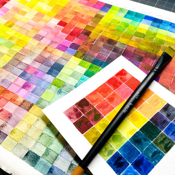
If so, then why not try creating a colour chart? It’s a simple yet effective way to see what you can achieve with your watercolours, plus you almost feel like a chemist, mixing and perfecting your formulae for the best colour combinations!
In this particular tutorial, I’ll be creating charts with Etchr’s Watercolour 24 Half Pan Set, which will also give you a better idea of the versatility of this palette.
Swatches Upon Swatches

In its most basic essence, a colour or mixing chart is a table of swatches. So if you’ve never swatched your paints before, now is a good time to do so!
It’s especially helpful as it gives you an exact colour sample of each paint colour, as oftentimes the paint’s colour will be different from what its packaging or saturated form may suggest.
Some paint sets even come with a swatch card like Etchr’s one does. To swatch, it’s best to use a flat brush and 300gsm watercolour paper. Make sure to label each colour as you swatch as well if your swatch card isn’t labelled already.
Bonus tip: If you use watercolour pans, you may have to label them as well, as some manufacturers only label the outside packaging and not the pan itself.
I also recommend swatching a gradation of each colour from saturated to diluted, as some colours look a little different depending on how saturated they are.
To do this, simply start with a saturated mixture of the colour, and about halfway through your swatch, rinse off most of the paint before continuing from where you left off and “pulling” the pigment to complete the colour swatch.
Colour Chart: Hue and Tone Version
Now that you’ve nailed the basic swatch, you can try making a colour chart! There are two main types of watercolour, the first of which is understanding the colours you can get from mixing it with every other colour.
To do this, draw a grid or table with the same number of rows and columns as the number of paints you want to use, plus 2. So for Etchr’s set, it has 24 colours, so I made a 26 x 26 grid.

The first row and first column will be where you label your paint, after erasing 4 cells in the top left corner. Each colour’s name should go in the same order both across and down.
The second row and second column will be swatches of each colour as they are. Try to aim for a medium paint saturation, and try to stay consistent with how much water you’re mixing into the paint each time.

The rest of the grid will be filled with your colour mixes. For example, my first row is for mixes where I must include Pure White. Moving across, the first one after the basic swatch intersects with the column for Pure White. You can either ignore this or if you don’t want to waste this box, fill it in with a diluted version of the colour.
The next column is Lemon Yellow, so I mixed Lemon Yellow with Pure White in a balanced ratio to produce the resulting mixture. The next is Just Yellow, so I mixed Lemon with Just Yellow in the same way, and swatch this colour. And so on, until I finished the Pure White row by mixing it with every other colour in the set.
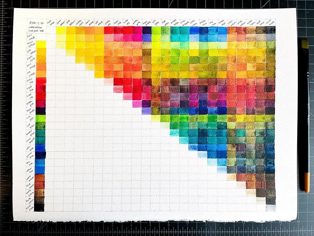
You’ll notice that the boxes going diagonally down the middle of the grid are redundant boxes since it’s where the same colour intersects. It’s up to you whether you want to block it out or not!
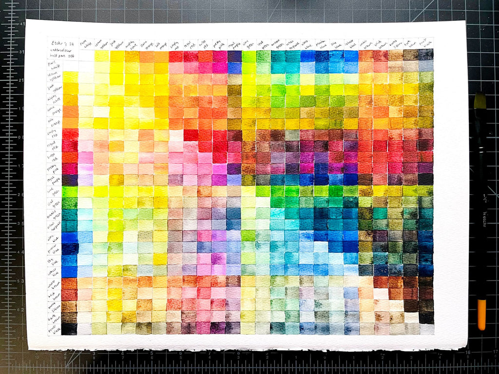
“But this only fills out half of the chart!” I hear you say. Well, you can use the other half to make the same mixes, but with a more diluted version. This will help you practice your water control as well, which is important in watercolour as that’s how to create different tones of the same colour.
In any case, you should end up with a lovely colour chart of what it looks like to mix each colour with every other colour in the same set, which you can and should refer to whenever you paint with that same set of colours.
Colour Chart: Mixing Version
Another way to create a mixing chart is detailed in this blog post. It’s still similar to the previous one, but the key difference is that you get to see colour mixes of different mixing ratios.

The first step is to create a grid-like before, but with the same number of rows and columns as the number of paints you want to experiment with. In my case, my grid is 6 x 6 boxes.

Next, paint in the diagonal boxes with a pure swatch of each colour. You can label them if you wish, though I don’t think it’s necessary.

This time, when you get to mixing, start at the top left colour. Boxes along the same column as this colour will have more of this colour than what you’re mixing with it, while boxes along the same row will be the opposite, where you mix in more of the other colour.
For example, my first colour is Simply Red. The next colour diagonal to it is Sweet Red, so the box directly under Simply Red will be mixed with a little Sweet Red, while the box directly to the right of Simply Red will have a little of it mixed with a lot more Sweet Red.
Every subsequent box will be mixed with the next colour, with mixes in the same column having more Simply Red, and mixes in the same row having less

This gives you a better idea of what your mixes will look like when you mix in more of one colour than another, giving you even more insight into how your mixes work! Though of course, the more colours you include in your chart, the longer it will take to complete, so doing this is best done within a limited palette.
Bonus tip: In fact, this is a really good method to help you when you ever want to build your limited colour palette! But that is a separate topic to learn.
Going Further Beyond

Despite the simplicity of making one of these charts, it takes quite some time to swatch all the different colours and mixtures, especially if you have a lot of colours to work with. But it’s weirdly calming in a way, and you can even relax while putting on your favourite show or listening to music.
And what about mixing more than two colours at a time? Well, you’ll have to experiment a bit more with mixing! Maybe you’ll discover a perfect mix to create a lovely colour to use.
What is your favourite colour mix? Do you create mixing charts for all your paints, or are you more selective? Let us know in the comments below! Also, feel free to subscribe to our email newsletter for more tips and tricks on creating art. We also announce our workshop schedule, giveaways, and new product releases there.
2 comments
This tutorial was so helpful, thanks so much!
Thank you!