

Colour theory is both art and science. Artfully, we use colour to express ourselves and send our audiences a thousand messages, but there is science in it, too. And that is why it works.
The technical and scientific rules of colour theory might feel out of touch with the intuitiveness of painting from our imaginations and innermost being. But if we’re able to comprehend the technical parts of “why” colour works the way it does, we can use it to enhance our art and portfolios.
Becoming Familiar with Colour Theory Terms
If we’re to understand colour theory and how we can best use it in our work, becoming familiar with the ins and outs of everything involved is imperative. This includes the terminology that comes along with the colour theory territory.
There are certainly several terms and definitions to keep in mind that can help you understand these principles better, and taking the time to learn everything there is to know about colour theory benefits us.
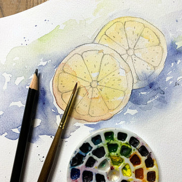
Mixing Colours
The Colour Wheel consists of three sets of colour: Primary Colours, Secondary Colours, and Tertiary Colours.
We’re all familiar with the primary colours. These colours are red, blue, and yellow. They are pure in that artists cannot make these colours by mixing other colours.
Secondary colours are created when we mix the primary colours: orange, green, and purple.
There are six tertiary colours. These colours occur when we mix primary and secondary colours together. We know them as blue-green, yellow-green, red-violet, blue-violet, etc.
And from these twelve basic colours, we create and mix every other colour.
Understanding where colour comes from and how to mix them is an important part of traditional painting.
Twelve basic colours (along with black and white) are all an artist really needs to mix a fairly complete colour pallet.
But what happens when you add a little black, white, or grey into a colour?
This is where hue, shade, tint, and tone come into play. A pure colour (untouched by black, white, or grey) is a hue.
When we add black to a hue, it becomes a shade. When white is added to a hue it becomes a tint, and when we add grey to a hue, it becomes a tone.
This is where we get pastels and dusty variants of colours. Pink is simply a tinted variation of red, and how much white you add or subtract from the red hue will affect the variation of pink that you end up with. The list goes on.
There are many variations for how adding black, white, or grey will change the colours we paint with.
A hands-on experience of mixing paints for ourselves to get the desired results can be a very helpful exercise to understanding colours tangibly.
It’s one thing to “understand” the theory, it’s another to realise it practically.
Understanding Colour Harmony
Just as it’s important to know how colours are mixed, it’s also important to know how they work in harmony with each other. Mixing colours is very much a science, but the science of colour harmony is aesthetically pleasing.
Colour harmony is the way colours work together in a way that our eyes find appealing.
Knowing the rules for colour harmony helps our art become appealing in more than just a compositional sense.
Just as understanding how colours are created and mixed improve our craft, using colour harmony to our advantage helps our craft as well.
Warm & Cool Colours
There are warm and cool colours on the colour wheel.
The warm colours are red, orange, and yellow, while cool colours are your blues, purples, and greens. Green can sometimes feel warm even though it is technically a cool colour.
This largely depends on whether or not it has a yellow or blue bias. The more yellow you add, the warmer the green feels Blue, on the other hand, makes green feel cool.
The way warm and cool colours work together is an important element of good composition. Our eyes naturally seek out warm colours in art.
Cool colours tend to recede in the background. If we use warm colours for the focal point of our composition and cool, soft colour for the background, our eyes draw into the focus of our piece.
Cool colours are often used when painting an atmospheric perspective. Using cool colours (such as blue and purple) gives the impression that objects are distant.
 Complementary colours are two colours on opposite sides of the colour wheel. Blue and orange; purple and yellow; green and red are a few classic examples of complementary colours.
They are also opposites in that one colour is warm and the other is cool. Using complementary colours in your work is a quick and easy way to bring interest to your piece.
Analogous colours are the colours sitting right next to each other on the colour wheel, such as violet, blue-violet, and blue.
When choosing a set of analogous colours for your pallet, use one colour as the focal point. The other analogous colours in the pallet can be used to support the central colour.

Triadic colours are any three colours equally spaced around the colour wheel. Purple, green, and orange is a perfect example of a triadic colour pallet.
Triadic colours tie into warm and cool colours. Because of its position, any set of triadic colours will have either two warm and one cool colour, or it will have two cool and one warm colour.
Once we understand colours, how they are mixed, and how they harmonise with each other, it’s easy to apply the knowledge into our work.
A bad colour palette can be distracting and off-putting, even if the viewer doesn’t understand why the imagery doesn’t work.
It might feel like a simple trick, but every work of art is improved from the correct use of colour theory—no matter how simple or complex the piece is.
In the end, a comprehensive knowledge of colour theory will result in a rewarding payoff.