

Have you ever wondered why some graphite drawings look so much more immersive than others?
Do you look at your graphite drawings and wonder why they’re so flat looking even though you paid attention to the values and structure in the picture?
Here are common technique pitfalls that you can avoid easily with just a little patience. Your drawings will become much stronger.
Mistake #1: Not sharpening your pencil.
Sharpening your pencil frequently can make you feel like you’re wasting money by eating the pencil up too quickly, but the reason you bought that pencil was to make good art and to make good art you need the pencil to be sharp.
A dull pencil will glide on top of the paper’s texture instead of touching the whole surface and making an even tone.
You will find yourself pressing too hard if your pencil is dull, and that will mar the paper’s surface and make the drawing overly glossy and difficult to layer over with more shading.
Since dull pencils are so imprecise, you will also have a difficult time getting the textures right on hair or another finely detailed part of the drawing. Do yourself a favour and keep your pencils sharp!
Mistake #2: Pressing too hard too early.

My pencil was slightly dull in this drawing, so I had to go back in later to define the edges of the picture.
Intuition tells you that to make the darkest areas of the drawing, you simply press hard with the 6B pencil over the white paper. This is not true.
Shade your drawing in layers, beginning lightly. The first layer of shading is a light, careful mapping of the darkest areas of the picture. Just glide over it evenly with an HB.
Once you have that, you can darken them with perhaps a 2B and then use the HB to go over the next darkest areas.
You’ll go on this way, gradually working darker with softer leads, until at the very end you’ll know where you actually have to press hard (and it won’t be too many places).
Mistake #3: Not paying attention to the direction of the pencil strokes.
It can be tempting to hurriedly fill in an area of your picture without considering the flow of the strokes, but for realism, it is better to follow the contour of the subject with your strokes.
Remember, real objects don’t look like an amalgamation of scribbles. The individual strokes won’t show up when they all flow in the same direction, and when individual strokes don’t show up, the object looks real.
Hint: Shade horizontally for the sky. The sky is a wide-open space.
Mistake #4: Being too afraid to darken the values.
Beginner artists often leave their drawings too low in contrast to the shadows to look real. The objects end up looking flat because of the low contrast. This is easy to fix!
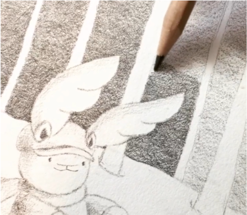
Here I am layering the shadows carefully. Notice how I keep the strokes all going in the same direction instead of scribbling. That keeps the section looking like all one object (the sky in this case).
Simply layer more darkness onto the darkest parts of the drawing. Light-coloured objects often have surprisingly dark shadows.
If you want the drawing to have a lighter effect (this is called “high key”), simply leave more of the highlights white to preserve the contrast.

Graphite is one of the most forgiving media out there, but it still requires patience and practice to use well. By avoiding these mistakes, you will be well on your way to beautiful graphite drawings.