
If you’re more familiar with colour theory, it’s good to learn how to use it to your advantage! So let’s take a closer look at colour temperature, and how to use it to your advantage.
Warm vs. Cool Colours

When we talk about “colour temperature”, we’re not telling you to dip your finger into your paint to check how cold or hot it is!
It’s actually more like colour association, where “warm” colours are considered “warm” because it resembles something hot; and something cold for “cool” colours.
This means colours in the yellow to the red range are generally considered “warm”, while colours in the blue to the green range are “cool”. Purple can be either, depending on whether it leans more towards red or blue.
With this knowledge, you can use it to affect the overall atmosphere of any painting. For example, trees with green leaves tend to give a much cooler feeling than trees with red leaves.
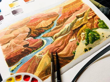
Another example would be how painting a seascape with all the blues and greens will “feel” cooler than painting a desert with reds, oranges, and yellows.
Another good way to use colour temperature this way is when painting day scenes versus night scenes, as having the sun up will warm up any scene (and time of day!).
In all honesty, though, it probably comes quite naturally for deciding which colours to use when painting certain things – mostly because people usually paint what they know (e.g. grass is green, water is blue, roses are red, etc).
This is the first level of using colour temperature – where you use warm colours for “hot” things or scenes, and cool colours for “cold” scenes. Pretty straightforward, right?
Cool Warm Colours and Warm Cool Colours

Well, there’s a little more to colour temperature than the basic colours! Let’s say you walk into your favourite art store to pick out some paints; a red you’d like to use for mixing. Turn the corner and boom! There’s more than one type of red.
You’ve probably seen them before: you have a more neutral red, like primary red. Then, you have a warmer red, like Pyrrol Scarlet. It’s just a touch brighter and warmer than the basic red.
Last but not least, you have your cool reds. These tend to lean more towards the pink range, like Quinacridone Rose or Alizarin Crimson.
You’ll see the same thing happen with other primary colours, so with yellow, a warm yellow would be Hansa Yellow Medium, a neutral one would be Cadmium Yellow, while a cool yellow would be Lemon Yellow.
For blues, a warm blue would be Indanthrene Blue, while a more neutral blue would be Cobalt Blue and Phthalo Turquoise a cool blue.
You can think of it this way: if a colour leans more towards the red to the orange range, it’s a warmer tone.
If it leans more towards the blue to the green range, it’s a cooler tone. And depending on which colour tones you mix, you’ll get different results.
The best way to learn would be to do a lot of mixing tests or create a mixing chart with your colours. You can see how to do this by reading this excellent blog post by Elsa.
In general, a cool + cool colour will create a cool colour. Warm + warm will be warm, while warm + cool will neutralise the resulting colour.
Neutrals and Earth Tones

So what about neutral and earth tones? Well, neutral colours are often useful for parts of a painting where you don’t want to go too warm or too cool – sort of in the “transitional” phase (think greys, or when mixing a warm colour with a cool colour).
Some may consider them “muddier” colours since they are never as vibrant as colours that are warm or cool.
Earth tones are colours that are in the brown spectrum or lean towards brown and are often considered more warm than cool.
Both neutrals and earth tones are less eye-catching than other colours, so they work well in backgrounds, or in contrast to where the focus of your painting should be.
If you’re ever unsure of whether a neutral or earth colour is more “warm” or “cool” though, lean more towards considering them as warm colours – especially earth tones!
Balancing Act

The final thing to do is to figure out the “sweet spot” between using warm and cool colours!
Generally, a good balance would be a 3:7 or 2:8 ratio, where you get to pick whether a painting has more cool colours or more warm colours.
You might think “balance” would mean going for a 50/50 even split, but oftentimes that will work against you.
Similar to how placing a horizon line right in the middle of the painting detracts from it, a 50/50 split has too much of a “sitting on the fence” vibe, and basically, your entire painting will end up being “lukewarm” – not warm, but not cool either.
So how would you go about adding a little but not too much cool colours to a warm painting, or vice versa?
Well, a warm painting could have cool shadows, or a bit of a blue sky, while a cool painting can have a smattering of warm-coloured flowers or other objects.
Of course, you could go all out and do a purely warm or purely cool painting. You may risk the painting looking a little monotonous, as there won’t be a lot of contrast, but some artists lean into this style.
In fact, camera filters do this automatically, so if you’re ever unsure of how to make a cool or warm painting, just snap a picture with the right filter on.
Nonetheless, the best thing to do is experiment and practice. It’s also a good idea to look at images that have good colour composition, such as movie stills from good cinematography, famous paintings, photographs, etc.
Whatever you can get your hands on! And as always, have fun painting – this time with temperature in mind.
What colour temperatures have you played with before? Do you prefer warm or cool paintings? Let us know in the comments below!