One of the first hurdles watercolour painters have to face is trying to mix the colour we want. It’s easy to end up with a muted colour when a vibrant one is needed and vice versa.
We soon experience the dreaded “mud”–also known as that flat, dull and lifeless colour that we didn’t mean to mix, yet is there on our palette. However, it is possible to mix exactly the colour we want and I’ll try to explain how in this article.
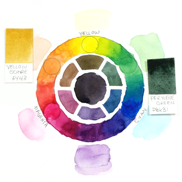
But first, a few basic facts. We need to start with the colour wheel and its three primary colours. The most common trio of colours is red, yellow, and blue, but it’s a bit limited on its own.
I prefer to start from the cyan, magenta, and yellow triad, the same as the one we find for most printed matter (from the large book printers to our little home printers). It’s a more versatile selection, since a red and a blue can be obtained from mixing these colours.

Another point to keep in mind is that mixing all three colours together will result in a neutral, dark grey.
The way we work with paint, no paint on the paper gives us white while all the paints together will give us our black.
Any mix of colour that includes the three primary colours will be more muted. (Our 37-well mini palette provides ample space for keeping track of all your colours!)
The best way to figure out a colour mix is to understand how the colour is made from our cyan, magenta, and yellow components.
Let’s consider red in this setting. We can get a red colour from mixing a small amount of yellow into our magenta.
This red is a lot of magenta (M) and a bit of yellow (y), so (M+y). If we look at blue, we can find it when we add a small amount of magenta into the cyan colour, so it’s like (C+m). If we mix red and blue, we add up all these cyan, magenta, and yellow components (C+m+M+y).
The purple we get from mixing red and blue is muted–this comes from the small amount of yellow that we have from the red.
To get the brighter purple, we would need to mix cyan and magenta, or blue and magenta.
Introducing the third primary colour means introducing a complementary colour to purple, so we will mute our purple down.

An excellent way to expand the range of mixes and feature the most vibrant secondary colours is to use what is called a “split primary” selection.
With this, we have a yellow that’s a bit more green and one that’s a bit more orange, a magenta and a red, a cyan and a blue. We can also use this configuration to create muted colours on purpose.

It might seem a bit difficult to break down colours into their primary components when it comes to colours like perylene green, yellow ochre, cadmium red, purple, and many others.
To figure this out, I ask myself two questions:
First, how close to black is this colour? The closer to black, the more of the three primary components will be in it.
Second, “If I had to name this colour with just one word, what would it be?” With perylene green, I would simply go with “green.”

Back on my colour wheel, I’d go to the green section and see if the perylene colour is more of a dark blue-green or a dark yellow-green.
Once I’ve found that, then it’s about reproducing the logic of the mix with our own colours. I’d mix cyan and yellow, with a lean toward the cyan, in strong saturation.
When I get a deep green, I progressively add magenta until the colour is as close to perylene green as I can make it.
The formula for it would be (C+Y+m). With a deep colour like perylene green as a goal, it’s important to mix from primary colours that are not too diluted.
Multi pigment paints vs single pigment paints

As far as I can tell, the number of pigments in a colour has no impact on the way it mixes. What can possibly throw a mix off its intended target are the other characteristics that we find in pigments.
Opaque and Transparent
Some pigments are opaque, that’s just the way they are. Yellow ochre, chromium oxide green, Indian red, all the cadmium colours, all the cobalt colours…
These pigments have particles that will prevent the light from going through the colour to the paper, and bounce back. Transparent colours are the opposite.
They let the light through so it reaches the white of the paper and bounces back to us. This post can teach you more about pigments and transparency.
Granulation
Not every pigment has the same particle size and weight. Granulation occurs when the pigment settles in clumps on the paper. A colour that doesn’t granulate will settle flat and evenly across the surface.
With practice, it can become very simple to reproduce a colour through mixing. The hue and value are the parameters we can interact with, while granulation and opacity are not something we generally have control over.
By understanding the components of the colour, we can more easily control the outcome of our paint mixes.