
Also known as fall, autumn is often associated with not just the flavour of pumpkin spice, but also a more muted colour palette.
This may be a little surprising considering the vibrant colours you get from trees changing their colours to fire, but since it’s the season just before winter and the end of the year, it makes sense to feel as if everything is slowly fading away.
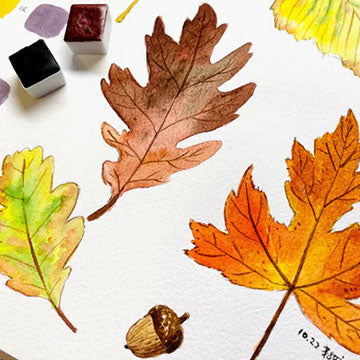
It’s even more true after the brief period of vibrant leaves, and things turn browner and drier. And there’s beauty in that, too! So we’ll show how you can capture this season’s colours in all its earthy colours, using a little help from colour theory.
The Easy Way

First off, there is a shortcut to getting this palette. It may feel like cheating, but you can buy premade autumn palettes! Even if you don’t get a specific set, you can go to a shop selling individual paints and buy colours with a more muted tone.
You can look up an autumn colour scheme and try matching similar colours to the scheme you like, or pick a few on your own. Some of these colours include: yellow ochre, natural red oxide, olive green, and Payne’s grey. Most shades of brown work well, too.
Since most of these colours are naturally warmer and more earth-toned, they harmonise with one another well, even if you don’t plan on mixing them. However, if you plan on including a few more vibrant colours, I suggest mixing them with a few other colours before using them, which I’ll elaborate on later.
In any case, if you just want to paint quickly or don’t want to spend so much time thinking about colour mixes, then this is a viable and convenient way to build an autumn palette.
Mixing Using Colour Theory

If you have a bit more time and want to gain a useful art skill, you can turn to good ol’ colour theory instead. I won’t get too much into it, as there’s a great blog on our website that focuses on colour theory! But in summary, to mute your colours, just mix in a little of its complementary colour.
For example, red and green are complementary colours, so if you want to make red a little less vibrant, mix in some green. The reverse is true, too – for a muted green, add a little red to it.
This works with yellow and purple, and blue and orange! You can also mix a variety of different browns if you adjust the ratios of each colour.
In theory, you could mix an entire autumn palette just by using the three primary colours of red, yellow, and blue, although it may take some time and personal practice to memorise how much each makes which colour.
Mixing with Warm vs Cool Colours

One last thing I’d like to note is that your colours will turn out differently depending on whether you mix paints that lean more towards cool or warm.
For example, lemon yellow is a cool yellow (even though yellow is usually a warm colour), while cadmium and Hansa yellow are warm yellows. Of course, you can also have more neutral yellows, like imidazoline yellow, but those will just default to their natural warm colour of yellow.
If you mix a cool primary with any other cool colour, the resulting colour tends to be more vibrant than if you mixed two warm colours. Mixing a cool colour tone with a warm colour tone produces a more neutral muddy/grey colour, so try to avoid this unless you’re painting shadows!
For the sake of the autumn palette, I recommend sticking with mostly warm versions of each colour you’re mixing and only mixing in a cool colour for more neutral greys and shadows. You can also have areas of cool colours, such as the sky, which will help contrast with all the warm colours!
Note: This is more along the lines of colour temperature, which you can learn more about here.
Colours of the Earth

Of course, autumn looks different depending on where you live. Maybe you live somewhere where there are only evergreen trees, so things just look a little darker and duller compared to summer.
On the other hand, maybe you live in a place where autumn doesn’t exist at all! So you’re free to adjust your palette to suit the feeling autumn gives to you, and what you see around you.
Regardless, it’s fun once in a while to build season-themed palettes, especially if you’ve never done it before! It’s also a fun way to train your colour mixing skills. It gives you a better understanding of colour theory and temperature, especially if you’re building your own palette from scratch.
Feel free to use the palette outside of the autumn season as well! And keep making more art.
What’s your favourite season? Have you ever tried to build a seasonal palette before? Let us know in the comments below! Additionally, if you’d like to learn more with us or about us, then feel free to subscribe to our newsletter. You’ll be kept up to date with our upcoming workshops, product releases, and flash sales, too!
Nicola Tsoi is a practicing graphic designer and illustrator based in Hong Kong. During her downtime, she likes to watch birds do funny things, search for stories, and bake up a storm. She keeps a pet sourdough starter named Doughy.