If you’ve taken lessons from an art instructor either in person or online, you may have done what’s called a “thumbnail sketch” before actually painting. But what is the point of the thumbnail sketch, and how does one make the most of it?
In today’s blog post, I’ll show you how to do a thumbnail sketch, and how to use it to its fullest potential!
Bigger Than an Actual Thumbnail
A thumbnail sketch is a quick sketch that’s roughly about 3cm x 5cm in size, give or take a centimetre or so, and depending on the shape and orientation you want the final painting to be.
It’s meant to be a small and quick sketch, as you want to do several of these to test out three things: 1. Your painting’s composition, 2. Where the major tones will be placed for the best contrast, and 3. Possible colour schemes. Doing a full-sized sketch for each of these tests will take way too long, which makes these small sketches perfect for some experimentation!
Drawing one is quite easy – just draw a rough frame that’s relatively to scale with your final painting’s shape, then add the basic outlines of your subject(s) to your sketch.
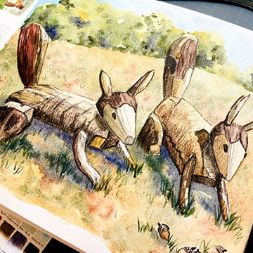
For example, I’m planning to paint these wooden squirrel sculptures I found at a nearby park. While one of my sketches can be exactly as the photo shows, I can do subsequent sketches where I play around with shifting the positions of the squirrels, the background, or even how to frame my subjects to make the focus on them clearer.
I then take my pencil and shade where the shadows, mid-tones, and highlights will be. Three tones are enough for this, otherwise it will take too long to finish one thumbnail sketch.
Tip: If you’re painting from real life or from a reference photo, and you’re not sure where the shadows or highlights are, try squinting your eyes. This makes it clear where they are, as restricting the amount of light coming into your eyes will help them focus on the general shapes and tones of everything! The other option is if it’s a photo, you can up the contrast with image editing on your phone or computer.
Note that it’s just a sketch, so even if it looks a bit rough, that’s totally fine! You want each one to take no more than a minute or two. As for how many to do, I’d say do at least three, and if you still aren’t happy with the composition, keep going until you are.
Once you’re done, you can even add washes of some general colours, just to see what the painting will look like with different colour schemes.
I’ve opted for an autumn look, so I picked a few earthier colours like burnt sienna and yellow ochre.
Always a Work in Progress

The point of the thumbnail sketch is to play around with possible compositions and see which one you like the most before moving on to the final sketch and painting.
This planning process may seem like an unnecessary step, but it helps prevent “composition regrets” later on! You’ll end up spending a little more time to potentially save a lot of time, so I definitely think it’s a worthwhile technique to learn and apply.
Once you get the hang of it, you’ll be flying through the composition phase so quickly that it becomes like second nature! The key is to train yourself on recognising the elements of a good composition, and learn to reposition or tweak things to enhance the concept or story you want to communicate within your painting.
And even if you settle on one composition, it doesn’t mean that it’s set in stone. Maybe you’ll need to adjust positions of certain subjects as you work on the final painting, or maybe some tones need to be enhanced, but at least you have a general framework to guide you while you make these tweaks. The key is to plan ahead with thumbnail sketches, and to keep exploring the boundaries of your art process!
Do you do thumbnail sketches before painting? What do you think makes a good composition? Let us know in the comments below! Also, if you’d like to learn more about the art process, then do subscribe to our newsletter. You’ll be kept up to date with our latest workshop schedule, product releases, and flash sales, too!
Nicola Tsoi is a practising graphic designer and illustrator based in Hong Kong. During her downtime, she likes to watch birds do funny things, search for stories, and bake up a storm. She keeps a pet sourdough starter named Doughy.


