If you can’t seem to find the right colour mixture for a particular part of your painting no matter how hard you try, there’s a chance you don’t fully understand how the pigments in your paints combine.
Just because red and blue theoretically make purple doesn’t mean that your particular red and blue paints will make purple and not brown!
Different pigments have different colour temperatures, making some mixing results different from what intuition would predict.
Now, you would eventually understand through trial and error how each of your paints combines, but what about saving yourself some time?
By making a mixing chart, you can see at a glance how each colour will react to the next and have that reference for years to come if you like.
Here’s how to do it.

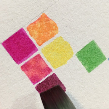
Begin by painting a tiny square of each of the paint colours in your set.
Put them in a diagonal line, in order from the coolest red on the top, through the warm reds, the oranges, yellows, greens, blues and purples.
Browns go last if you have them.
The demo I’m doing here has a very small colour selection, but the big chart at the top of the post has more variety and you can see where I put the brown. 
Now that we’ve laid the foundations, it’s time to build the rest of the chart.
Imagine each colour being in its own horizontal row and vertical column.
We’re going to start in the top corner, with red (or in my case, pink because my paint set was a bit funky).
In this example, the next colour both beside it and below it is yellow.
So for the square directly beneath red and next to yellow, put mainly red and a little bit of yellow.
For the square above yellow and next to red, put mainly yellow and a little bit of red.
The vertical column for each colour will have the mixtures be mostly that colour, while the row intersecting the colour horizontally will show how it looks in small amounts with the other colours. 
When you finish the colour in the top corner, go to the next one and fill in the blanks.
Remember that the mixtures in the vertical columns should mostly consist of that column’s main colour, while the horizontal rows will be mixtures with less of the main colour.
The result is quite a pleasing gradient!
When you are all finished, you can hang the result on your wall above your desk, and use it as reference for when you need to decide how to get the colours you want!
Also, an exercise like this is worthwhile if you want to know how many paint colours you really need to buy.
My set of four paints that I used in the demo was capable of sixteen distinctive colours, and I’m sure there are more combinations than that if I mix more than two.


