I was fortunate to have learned the importance of line variation early in my career. Before ever applying colour to my drawings, I worked for years with just black ink.
I made sure to vary the lines I drew so they would “speak,” thus holding the eye of the viewer for just a couple more seconds. Lines really do speak–which is why the pen has always been mightier than the sword.
Let’s face it, people visually digest images way before reading text–just like you probably noticed an image in this post before diving into the words.
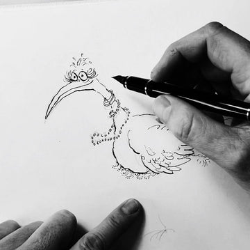
Let me show you how to add line variation to your own drawings using this little bird I’ve drawn in my Etchr sketchbook as an example.
Thin and Thick Lines

I make sure to incorporate thin lines right next to others that are thick. This is always on purpose for line variation and expression. If all the lines were the same thickness it would have a completely different look and feel.
I’ve seen finished drawings with no line variation that work really well, but I’ve always been more attracted to expressive lines–hair-thin strokes next to large, fat, tall, and shorter lines. I love the look of lines that appear as though they accidentally happened onto the paper.
You can practice making line variation by holding your pen or brush lightly as you sketch or ink a drawing. I used dip pens for years but in the last few have converted to fountain pens with very flexible nibs.
(I still enjoy using dip pens but they’re a little messy so I don’t travel with them.)
Brushes are great for producing the thickest of the lines. Applying more pressure here and there and creating a "bounce" with your fountain pen or brush while making your way through the drawing will give it some life.
Adding a line that is thicker will speak louder amongst the thinner ones, so think about what you’re trying to “say” or portray in your drawing. Feathers, summer dresses, leaves from trees or plants, and jewellery can all be drawn to look light and airy with thinner lines.
Remember that applying too many lines with the same weight can result in a flat-looking drawing. Maybe this is what you’re trying to achieve.
If not, try to use thicker lines to weigh down heavier subjects and to put an emphasis on importance. Lighter and thinner lines show delicateness, calmness, and can also be used for perspective to push things further into the background.
Swirly and Straight Lines

Swirly lines are fun! Giving some swirly lines to eyelashes or to the feathers of a little female bird can help create a more "feminine" look.
Think of the whiskers on a cat, or someone with wispy hair blowing in the wind. This effect can be conveyed in your drawing by holding your pen lightly and swirling in some thin lines.
If you try outlining those swirly lines with small dots, you’re likely to produce a delicate lace-like feel to that subject like I have here on the bird's feathers. Try adding some swirl for more expression in your next finished drawing.
At least to me, straight lines seem to be the odd ball out. This is the person in a three piece suit who stands in the corner of the room during a dance party.
These lines definitely have their place and I wouldn’t not want them, but loosen up! Have you ever noticed how the straight lines of a building when drawn a little crooked adds character?
Bold Lines

Scratchy-looking bold lines are probably my favourite lines to include in drawings. They can add some serious feelings to your drawing! Large, scratchy, and bold lines can visually say I’m angry, happy, irrational, confused, solid, or emotionally heavy.
These lines mixed in with thinner ones are often the loudest, and many times the very first lines viewers will see. You can easily add scratchy and bold lines to a part of your drawing by feeling what it is that you’re applying ink to.
What is it that you want the viewer to look at? Ask yourself, “What needs to look heavy? What needs to jump out?” Putting a little extra pressure here and there on your pen or brush, especially in areas that you want people to look, at will create “louder” lines.
If you are trying to anchor an elephant in your drawing to the ground you could draw large bold lines on those huge feet to solve that problem.
Using bold and scratchy looking lines around the parts of an angry dog's face always seems to make an angry dog appear even angrier.
Or maybe you’re simply trying to weigh down a little bird who might otherwise float off the paper because of all the light lines you composed it with. Adding just a few bold lines on the underneath of that bird's belly will help.
Spice Up Your Drawing

We know that beauty is in the eye of the beholder but being able to channel your emotions onto paper through an expressive line that’s powerful enough for the viewer to feel is magic!
So the next time your drawing needs a certain area or subject to appear more delicate, consider conveying that feeling by holding your pen lighter to create thinner and more wispy lines.
In the same drawing if there’s something that needs weight or you just want to say “Look at this, it’s important!” then add some pressure to your brush.
Line variations are a lot like adding spices to our favourite dish–a little sprinkle of this and a little bit of that, but most important is to not overdo it with any one spice, or line, in this case.
Have you given these methods a try, and how did the result come out? Tell me about it in the comments!
2 comments
Thank you for reading and for the kind words, Angela! <3
These are some great tips! And I like the drawing, that’s a benefit!