It also may seem quite difficult to get a dark enough colour, since watercolours are so transparent. But it is possible with a bit of layering, so let's jump right in and take a look at painting the night.
Pick A Night Sky
While we all live under the same sky, it will look different depending on where you live, what season it is, and what the weather's like.
Most colourful night skies are in areas where city lights can't interfere with natural lights like the moon and stars, so I would recommend looking up pictures of such places. If you live in such an area, then that's even better!
Bonus tip: Scandinavian countries often have fantastic night scenes due to the low population density and their position relative to the Arctic Circle. They also have some of the best places to go stargazing, even on nights where the Northern Lights don't appear!
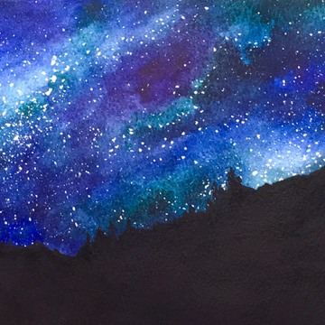
I would also recommend planning some sort of foreground silhouette, just to add some extra contrast to the sky.
This can be trees, buildings, or mountains, and helps keep the painting grounded. If you don't add a foreground, that's fine too, though it will look more like a painting of outer space instead.
A Light Layer

For clear skies, you can gradually pick out the sweeping edges of the galaxies, and have the stars clustered in a random but smooth shape.
In either case, choose 2-3 colours that are different from the dark blue or purple colour you'll use for the night. I'd recommend anything from the red, blue, and green spectrum, and avoiding neutrals and yellows.
Next, use a large mop brush to wet your paper with clean water, then add the different colours in different sections to get the smoothest colour blends. This is known as the "wet-in-wet" technique, where you put wet paint on the surface and let the colours mingle on the paper itself.
As this is just your first layer, remember that it's ok to keep certain areas lighter than others, especially around where the moon is (if there is one in your composition) and where star clusters will be.
Building Up
 After your first layer is dry, keep building up layers of colour in the same way, making the dark areas darker and keeping the light areas relatively untouched. You can do this by gradually mixing in more and more of your dark blue/purple paint while the paper is still wet.
To get the best effect, make sure you're using 100% cotton watercolour paper! And since you'll need to have at least 3-4 layers of paint, the paper should also be at least 200gsm thick, which makes the Etchr Sketchbooks perfect for paintings like this.
This is because it can take a lot more layers of paint without too much warping, and it creates some of the best blends for watercolours.
Darkness and Light

For the final sky layer, use a pretty saturated dark blue/purple to really contrast against the lighter areas. And when that's done and dry, you can add the moon and/or stars.
There are 2 ways you could do this: a) Use a white gel pen, or b) Use white gouache paint.
For carefully placed stars, I would recommend the gel pen, or gouache paint and a paintbrush. For random stars, dip an old toothbrush in diluted white gouache paint, and flick the bristles towards your painting for a splattering of stars. You could also mix the different methods if you want!
Just remember not to overdo the stars, or else it can get too excessive.
Foreground Silhouette

Last but not least, you can paint the optional foreground using your darkest colour and a smaller round brush for details. You could technically use black, but since black is a dead-looking colour, it's never a good idea to use too much of it.
It can be mixed into a blue or purple, though just be careful not to add too much when doing so. Adjust details and stars as you see fit, and once that's dry, you have your night sky!
Bonus tip: If you find this part difficult, you can do a light outline of the silhouette in pencil or in a white watercolour pencil before filling it in.
End of the Day

Hopefully, after trying this, you'll have the confidence to try another night-time watercolour painting. It definitely gets you thinking more about what colours look like in the dark, and how to achieve that effect!
The key is to still have a little bit of contrast, especially when the moon and stars are out. And as always, remember to have fun painting.
Want to try a different type of night sky? Check out this blog post on how to paint the northern lights!
What's your favourite night sky scene? Have you ever painted something after a stargazing session? Let us know in the comments below!