
They say the skin is just a colour, but even so, there has always been something perplexing about complexion.
It’s definitely one of the more difficult colours to mix, especially if you don’t have a pre-made paint for it!
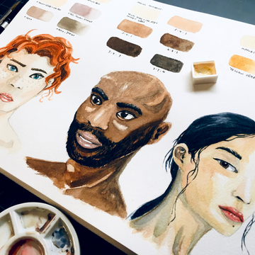
In today’s blog post, I’ll be showing you 3 different ways to tackle skin colours – from a more traditional standpoint to a more unconventional one.
Method 1: Premade Colours

While I don’t have one of those palettes made up of solely skin tones, I do have one kind of paint I like to use when I’m pressed for time. It’s called Jaune Brilliant No. 1 and is a great base skin tone for a more generic Caucasian complexion.
It’s a little bit pale though, so sometimes I like to add some extra colour to it, such as a dash of red for a pinker hue, or even a little red and a tiny bit of blue to darken the colour.
You could also directly add brown for darker skin tones, but the result isn’t as satisfying as mixing the colour yourself (which we’ll look at in the next method).
Another downside is that premade skin tone colours tend to have white mixed in with them, which makes them slightly opaque when saturated.
This is fine for using gouache or if you need opaque watercolours, but if you want to keep watercolour’s natural transparency, you’ll need to dilute it a bit, which will also affect the final results.
It boils down to personal preference though, and to be honest, the convenience of premade skin tones sometimes overrides the disadvantages.
It’s also a great option for when you’re just doing quick painting studies, so there’s definitely a time and place for these paints!
Bonus Tip: It’s always best to start with quite a diluted mixture, especially with lighter skin complexions. Even a tiny bit of paint goes a long way, so don’t be too heavy-handed! With watercolours, you want to use the white of the paper to your advantage.
Method 2: Mixing Your Own

The next step would be mixing your own. It took me a long time to learn it myself, but skin tones are really made up of all 3 primary colours, which makes sense because skin tones are closest to different shades of brown, ranging from the lightest (such as beige) to the darkest (such as sepia).
One of the biggest differences is that skin tones often have more of a peachy undertone, though they could lean redder (for Caucasians), olive (for Asians and Latinos), or brown (for Africans).
But I would say a good base to start off would be mixing yellow and red for a peachy colour, before adding a tiny amount of blue bit by bit, until you get the skin tone you like.
If I had to put a ratio for yellow to red to blue, I would say around 5:4:1 – give or take. You’ll need to adjust it according to what your eye sees through, as darker complexions require more blue.
Additionally, primary colours have a warmer or cooler side to them (check out this post on colour theory for a more in-depth look).
I would recommend using the warmer primaries, as human skin is a living organism, and anything with life will always have a warmth to them.
Unless your concept is aiming for the opposite effect, in which case feel free to use the cooler primaries!
Once you’ve gotten the hang of getting the right ratio for the colours, feel free to experiment and paint different skin tones. It’s also natural that the same person would have a variation of skin tones depending on the part of their body, so you’ll need to adjust your paint mixes anyway.
Tip: It’s best to have a palette with several wells, so you can mix all the tones you’ll need in one go! It will be quite difficult to mix the exact same skin tone again, especially since the paint dries a different colour than when you first put it down.
Method 3: A Colourful Concoction

The third method, which (for me) is the most difficult one, is to lay down your paints as they are, either via glazing or mixing your paints on the paper.
This allows the natural transparency of watercolour paint to create a sense of depth, while also lets the viewer’s eyes do the “colour mixing” themselves.
It’s similar to the concept of pointillism or pixelating, where many dots may look like a jumbled mess up close, but come together in a cohesive painting once you move further away.
Several artists are amazing at doing this, but their proficiency definitely comes from a lot of practice and experimentation!
The basic idea is to pick 2-4 main colours (generally one or two lighter colours, a mid-tone, and a darker one), then paint the lightest areas with your lightest colour, the mid-tones with the middle one, and the shadows and details (such as eyes and wrinkles) with the darkest colour.
If you’re working with only 2 colours, you can mix them to create a mid-tone, which will help create a better transition between light and dark.
But in general, the more contrast you create, the more simple yet dramatic the final painting will be.
Just a Colour

Whichever method you choose to follow, the best way to practice would be to start with what you’re most familiar with – that is, your own skin colour.
Once you’ve practised enough, you can try mixing other skin tones, until you find a formula or a mixing ratio you like for each one.
Last but certainly not least, remember to enjoy the process! Whether it’s your first or thousandth time, there’s always something new to discover and learn.
Do you like painting portraits and/or human figures? What’s your go-to mixing process for painting skin (if you have one)? Feel free to share with us in the comments below!