Although not every superhero needs a sidekick, a good sidekick can act as a good complement to the hero!
I find the same rings true for backgrounds and foregrounds because even though the focus of any painting should be on the foreground, a good background can make a painting feel much more complete without detracting from the main subject.
I’ll be sharing a few quick tips below, so grab your painting tools of choice if you want to follow along!
Block It In
The key is to keep your background simple, but discernible. A very quick and easy way to do this is to simplify your background into more general shapes and leave out most of the details.

If it’s your first time, try doing a thumbnail sketch using a pencil on paper. If you want, you can also remove the foreground, or whatever the main subject was supposed to be.
I’ve drawn two sketches of landscapes in comparison – one where I’ve included too many details, and one where I’ve simplified it so it still reads as a landscape, but without the extra frill. I’ve also included the main tones to add a sense of depth. Can you see how too many details are distracting?

I drew two more thumbnail sketches, this time with the foreground added in. It should be clearer here how the detailed background on the left distracts from the foreground, while the one on the right helps the foreground stand out more.
Choosing Colours

Once you’ve figured things out in your sketch, you can try the next step, which is to paint it. I highly recommend a large flat or mop brush for blocking in your colours, because it takes away the temptation to start adding details or small things.
In terms of colours, try considering what the base colour of your foreground and/or main subject will be. Whatever it is, your background will complement it by being complementary in colour!
For example, if your main subject is red, then your background should be green. If it’s yellow, then it should be purple, and so on.

You can also apply the theory of colour temperature here, as warm colours are generally more stimulating and indicate more emotion/action, while cool colours are more calming and less active. In any case, try to play into the strengths of these different types of contrast, and see what your subject calls for.
Bonus tip: When factoring in these colour choices into your painting, don’t feel like you have to make all of the foreground one single monochromatic colour. The key is to make things generally one colour! This means it’s okay to add in some other colours as long as you feel like it won’t be a distraction to the overall piece.
Add Your Foreground

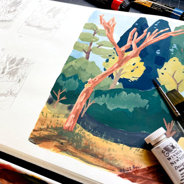
The last step, of course, is to add your foreground. If you’re using watercolours, try to paint around your main subject, as the underlying layers will show through. If you’re using any type of opaque paint, like gouache or acrylic, you can paint directly on top of your background, which I’ve done with mine.
With the foreground, you can add more details, which will contrast well with the “blockier” background. It also helps to give the illusion of depth and make your foreground stand out more.
Setting the Scene

The main point of blocking in your background is to quickly set the scene without detracting away from your focal point. Of course, you can always go back to rework your background or add more details later if needed.
But because the human eye is naturally inclined to find meaning in even the vaguest of shapes, artists can often get away with adding fewer details and focusing on expressive brushstrokes instead.
Either way, feel free to explore and play around on your own, and see what works best for you and your art! There’s always something new to learn, whether it’s on your own or with a little help here and there.
How do you usually paint your backgrounds? Have you experimented with different methods before? Let us know in the comments below!
Also, if you’re interested in learning more about the creative process, feel free to subscribe to our email newsletter. Whether you’re experimenting or want to dive deeper into the art world, we’ll notify you of all the latest happenings with Etchr!
3 comments
Very helpful I am on a solo learning journey and pithy and direct instruction like this article is a godsend. thanks.
Learned a lot more on how to work from thumbnail sketches and tips to fully develop your paintings before lifting our paint and brushes. Thank you
Thank you for this interesting and helpful set of tips. I only use watercolor in my sketchbook to put some life to my sketches but backgrounds whether watercolor or oils are always a challenge for me.