Understanding colour theory is essential for artists of all skill levels. In this blog, we’ll go over some colour basics like painting our colour wheel, mixing colours, and understanding the relationship between different colours.
The supplies used in the examples below included Etchr Lab’s Watercolour 24 Half Pan Set, Watercolour Brushes: Set of 10, and The Perfect Sketchbook.
What is a Colour Wheel?
A colour wheel is a tool used by artists and designers that shows the relationship between primary, secondary, and tertiary colours. Colour wheels can help you select a colour scheme for a piece of artwork, and we can make this tool ourselves at home with some paint and paper.

While creating our colour wheel, we will also practise some colour mixing basics.
How to Paint a Colour Wheel
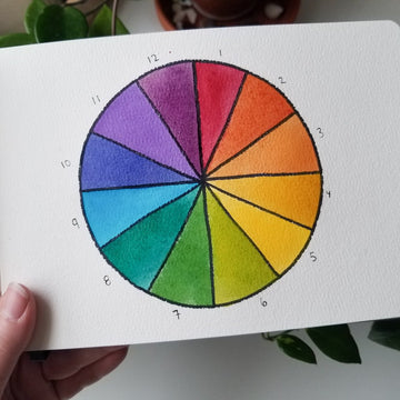
Using a protractor or a circular object, draw a circle onto your paper. Next, using a ruler, divide the circle into 12 even slices like in the example below. You can use a permanent marker or a waterproof ink pen to bold the outlines.

You do not need to number your colour wheel, but we numbered ours in the example above to make it easier for you to follow along.
Fill in slices 1, 5, and 9 with the primary colours: red, blue, and yellow. These should each be three slices apart. What are primary colours? They are colours that cannot be created by mixing other colours. These three colours are the basis of all other colours.

In these next steps, we will begin to practice colour mixing. We will start by mixing our primary colours to get secondary colours.
Mixing equal parts yellow and red makes orange (slice 3), yellow and blue make green (slice 7), and blue and red makes violet (slice 11).

Next, we will mix our secondaries and primaries to make tertiary colours. See the formulas below and their corresponding slices.
Red + orange = red orange (slice 2)
Orange + yellow = yellow orange (slice 4)
Yellow + green = yellow green (slice 6)
Green + blue = blue green (slice 8)
Blue + violet = blue violet (slice 10)
Violet + red = red violet (slice 12)

Now we have completed our colour wheel! If you ever feel unsure how to mix colours or use them in a painting, just refer to your colour wheel. If you found mixing the colours challenging for your colour wheel, don’t let that discourage you: Understanding colour theory takes practise!
Mixing Neutral Colours: Brown and Grey
If you don’t already have brown or grey in your paint collection, you can mix them yourself!
Grey: Ideally, you would make grey by watering down black paint with watercolour. However, if you don’t have black paint, you can make grey by mixing equal parts of complementary colours (colours opposite to each other on the colour wheel). For example, you can mix equal parts yellow and violet or green and red to get grey.
Brown: You can make brown by mixing two parts red and one part green, or experiment with the ratios until you are happy with the results.

Warm vs. Cool Colours
We tend to associate specific colours with certain temperatures and moods. Warm colours include yellows, reds, and oranges, and they tend to make us think of heat. They also evoke feelings of passion, joy, anger, or danger. Cool colours include blues, violets, and greens, and they tend to make us think of colder temperatures. They also have a calming effect, and you can often see these colours used in waiting rooms.
Colour Relationships: Complementary, Analogous, Monochromatic, and Triadic
Do you ever struggle with picking colours to use together in a painting? Understanding the relationship between colours can help you select colours that look good together. Depending on what colours you choose, you can create a certain mood or draw the viewer’s eyes in a certain way. Below, we will go over the definitions of different colour relationships with some examples from history.
Complementary: Complementary colours are opposite to each other on the colour wheel. Vincent Van Gogh famously used complementary colours throughout his body of work. In his painting “Starry Night”, Van Gogh created a blue night sky with a yellow moon and stars.

Analogous: Analogous colours are a group of three colours next to each other on the colour wheel. “Waterlilies and Japanese Bridge” by Claude Monet uses an analogous colour scheme of blue, blue-green, and green.

Monochromatic: A monochromatic colour scheme uses only a single colour. Pablo Picasso created a series of paintings known as “The Blue Period”, in which he primarily or exclusively used blue.

Triadic: Triadic colours are a group of three separated by three colours on the colour wheel. Andy Warhol often used triadic colour schemes, as seen in his series of Marilyn Monroe portraits.

Now you can use your newfound colour theory knowledge to make all kinds of beautiful art. Show us your work by uploading your art to Instagram and tagging Etchr Lab.
We hope you found this information helpful! Subscribe to our email newsletter for more art tips and news on our products.