I spent ten years drawing strictly with black ink on white paper. Trying to learn how to use black effectively in a composition that stops most eyes on the spot is challenging.
(Check out Part 1 of this blog: Varying Your Lines for Expression.)
Using watercolour on top of black line can make our drawings look even more visually appealing but it also presents a new set of concerns.
In this blog, let’s take a look at how you can simply and effectively add colour to your black line drawing. If you want to follow along in video format, you can check out my FREE Demo.
Keep It Simple.

I didn’t know very much about putting colour on paper early in my career, so I started at the beginning.
And I don’t mean “the beginning” as in learning about mixing primary colours like everyone should. I mean “the beginning”, as in using fifty colours from a ninety-six pan watercolour palette each time I painted. Yikes!
My current watercolour palette is pretty simple. It consists of 15 different colours that are transparent. I would highly suggest a more simple palette to anyone just starting out.
Consider using transparent watercolours so your black lines aren’t covered over by more opaque colours. Opaque colours leave a chalky look which is great but only if that’s what you’re looking for.
It took me a while to find the transparent colours I use and simplify my palette but I’m happy I did. Fifteen colours just feels like the right amount I can handle without getting into too much trouble.
There’s no right or wrong answer to how many colours you might choose to work with but here’s a tip - If you keep it simple, you’ll get to know the colours on your palette intimately and how they mix.
Any time you’re struggling with colour, remind yourself as I do most regularly, to keep it simple.
Try to choose just three primary colours to complete a painting. If you have to add a neutral or a sepia as a fourth colour that’s okay, but keeping it simple will help your finished painting have a more cohesive look.
The three colours I choose might be different each time I paint but it’s still just three out of the fifteen colours I know intimately in my palette. You might consider practicing this colour minimalism.
Background Colour or Underpainting First

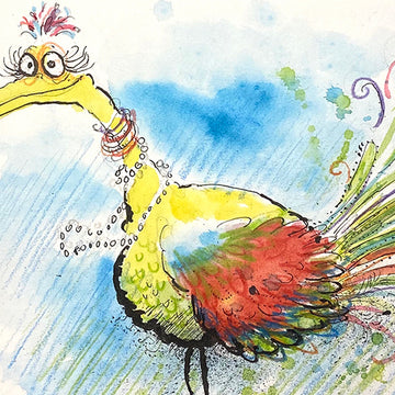
First, choose the three colours you’ll be using. Since this bird is really playful looking, I chose three primary colours that are bright and mix well together. This will help ensure that the colours continue the happy and playful look of the bird.
Start by applying water randomly around the main subject or subjects if your drawing is more involved. I started by laying in light blue around the bird.
The water helps to spread the colour out and create shapes as expressive as the black lines once it dries.
If you don’t want hard looking edges of colour, keep brushing more water on the outer edges of the blue background and there will be more of a balance between smooth and hard edges when it dries.
Focusing Your Point With Complimentary Colours

Since I used blue for the background, I coloured a portion of the bird’s wing orange to compliment the blue and ensure that the viewer's eye will find the orange part of that multicoloured wing fast.
Since there’s some red in the wing too, I mixed blue and yellow to create a bright green on those fun looking tail feathers. Doing so will bring the viewer's eye back to the wing.
It’s only three colours but looks bright, happy, and they all work together well! Try using simple complimentary colours in your drawing to direct the viewer's eyes to what you want them to see.
Lines, Splashes, and Mistakes

Drawing additional feathers in different colours with a brush or colour pencil in between the black lines really started to give the bird some life. You might consider leaving some open space to draw in lines with colour too.
Try to keep the colours loose and expressive all along the way so they match your expressive black lines. Let your colours run together and let the spatters or drips from your brushes and pens happen along the way.
I’ll add even more random splashes of colour to create more layers and texture which in my humble opinion makes the drawing more interesting to look at. I’ve always referred to the spatters I make and see in other artists' work as, “life”.
Here’s another tip - If you need to cover up something you don’t care for, you can do so with an opaque watercolour or white gel pen. Also, don’t be too concerned with your pencil lines if they’re not completely hidden.
I make a habit of not erasing all of my pencil lines. To me they represent where our drawings started. There's a feeling in those loose pencil lines that you don’t have to cover.
These pencil lines and things we have covered, although we can see them, serve as a map of how our creative battle played out.
The next time you’re looking at another artist's work, see if you can spot those skirmishes that happened on the creative battlefield. Not to mention, it’s a great insight on how that artist works!
Finishing Lines

After you lay in all the colour, you might need to go back and beef up a black line or two. Don’t let those chunky lines, like the ones on this bird take a back seat.
Drawing in little shapes with colour pencil or simply a few scratchy lines in the background really adds another layer of spontaneity. Try using colour pencils for light background texture that won’t overpower the subjects you have inked in the foreground.
These finishing touches and a few additional colour pencil lines will really help bring your drawing together.
Share your thoughts with me! We’re creative people who are eager to learn more about art and can do it together by sharing ideas, knowledge, and comments.
1 comment
Thank you …that was so helpful