One of the hardest things about learning how to paint is knowing which colours to grab to get the results that you want, especially if you have lots of different colours on your palette.
Even if you already know the rules and theories on how to use colour.
If you haven’t taken the time to get to know all of the colours on your palette and how they interact with each other, you might not know the exact colour complement to reach for that will perfectly neutralize the Sky Blue you already have on your brush.
If you know that the complement of blue is orange, you might reach for a colour that’s called “Soft Orange” without realizing it will combine with the Sky Blue to make the most amazing luminescent green.
And while it’s a beautiful and useful colour- it’s not the neutral grey you were expecting.
When I first started using watercolours, I filled my palette with colours but didn’t spend enough time mixing them. As a result, I found myself always choosing colour combinations that were safe and familiar.
Having a thorough understanding of your palette will give you more freedom and flexibility to make interesting colour choices instead of always resorting to your old standbys.
So how do you learn which colours to choose? You could go to the art store and pick up a pre-made colour wheel to help guide you, but you’ll probably find that the colours on those wheels look nothing like your paints.
There are infinite numbers of colours and brands of paint even, colours with the same name or pigment numbers can vary widely across different brands. Even the water you use can cause paints to appear different.
A pre-made colour wheel can be helpful if you need help with basic colour mixing rules (i.e. red + blue = purple) or if you need a visual reminder that blue-green is the compliment of red-orange.
Generic colour wheels can point you in the right direction, but you won’t learn how the colours on YOUR palette work together without mixing them yourself.
So what is an artist to do? Make your own colour wheel from the paints and paper you actually use! The time you spend mixing and experimenting with the colours you have will give you invaluable information that will help you make better colour choices every time you paint.
So let’s make a colour wheel!
Step 1: Get to Know Your Colors
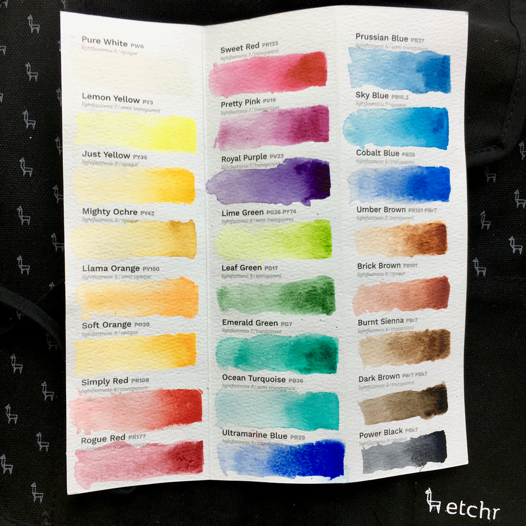
For this colour wheel exercise, I’ll be using the Etchr Watercolor 24 Half-Pan Set. It is a really nice set of high-quality student grade paints with 24 pigments including, white and black. You can make your colour wheel with whatever palette you have.
The first thing I always do with a new colour palette is sit down and paint swatches to see how each colour looks on its own. When I do this — I try to create a graded wash that transitions from the colour’s mass tone — or most solid version of the colour — to its most diluted form.
Step 2: Find Approximate Complement 
To arrange the colours into a wheel, I’ll need to figure out which colours, on the palette are
complement s — meaning which colours perfectly neutralize each other.
This is where a pre-made colour wheel can come in handy—you can use one to help you narrow down the choices for each colour.
I knew that anything resembling a red or pink would need to be tested against anything that could belong in the green category.
The blues would be paired with oranges, and the purples would be tested with the yellows. Note that there may be some overlap between categories.
Step 3: Neutralization Testing

Next, I created a grid to test colour mixes. In the first column is each colour to be tested and across the top row, each possible complementary colour.
This format allows me to see which potential complement does the best job of neutralizing each colour and ensures that I don’t omit any combinations.

It can be hard to judge colours from just a tiny square. A few of the results were too close to decide, so I tested some combinations on larger squares using a technique that would give me more information about how the colours would mingle together on paper.
Make Your Color Wheel

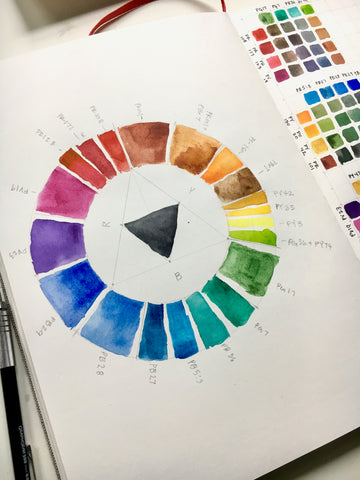
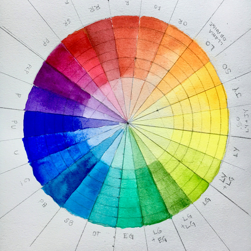
On a sheet of watercolour paper, I drew an equilateral triangle to help divide my colour wheel into three sections (reds, blues and yellows).

Around the triangle, I used a compass to draw concentric circles to make a “doughnut” shape for the colour wheel.
Make sure to make your doughnut pretty thick to leave enough space to paint your colours. Then use a ruler to divide the doughnut into 12 equal sections.

I created a small colour swatch card for each colour in my palette and arranged the cards on the colour wheel. This allowed me to move the colours until I was satisfied with their placement before I painted them onto the wheel.

A Few Notes and Nerdy Observations
Color Wheel Format Explained
The purpose of this exercise was to find a complementary colour match for each colour in my palette so I could learn how to mix them.
Somehow, I needed to fit 21 colours into a wheel with only 12 sections (for primary, secondary, and tertiary colours).
In my testing, I found that some of the colours had multiple good matches, but not all of these matches were perfect compliments. I still wanted them in the colour wheel so that I would understand how to use them.
My solution was to split some sections up to accommodate more pigments. For example, you’ll see that the primary red section of the colour wheel is split into three colours and the green section directly opposite is split into two.
That was because the Emerald Green and Ocean Turquoise both did a pretty good job of neutralizing all three reds in the palette. So I included all of them, arranged from coolest to warmest.
Now I know that if I am looking for a complement to green which yields a grey with a more purple bias, I’ll choose the PR123 (Sweet Red) because it’s closer to the purples. If I want a warmer grey I’ll choose PR108 (Simply Red) because it’s closest to the oranges.
While this may not be a perfect solution, technically speaking, I felt it would give me the most practical information for my colour mixing with this palette.
Inclusion of Browns
Colour wheels typically don’t include browns, but since I was looking for colour complement, I treated them just like any colour for this exercise.
The most surprising result of my colour tests was that some of the browns made better complements for the blues than any of the oranges.
And both of the colours that are called “orange” created good greens but didn’t neutralize the blues. When looking for colour complements remember that colour names can sometimes be misleading!
Omitted Colors
I didn’t include Pure White or Power Black on my wheel. I also decided to remove the Dark Brown since it is a mix of Burnt Sienna and Power Black.
1 comment
Thank you for posting this! Your thoughtful and careful color experiment was really good information! I think I’ll try something similar with my oils.