Acrylic paint is one of the most versatile types of paint you can buy. It’s water-soluble, which makes it easy to thin out, and easy to clean up too.
Once it dries, it cannot be rewet, which means you can layer it and paint over your mistakes to your heart’s content.
Acrylic paint can work on any surface you would use for watercolour and gouache, and also works well on canvas the way oil paint would.
Since the texture of the canvas makes it challenging, that is what I will be using in this demonstration.
Acrylic paint goes on smoother when the paintbrush is dipped in water periodically to moisten it.

For the sake of demonstration, I am painting a red tomato. Green is the complementary colour to red, so I am making the background here subtly green by mixing titanium white, yellow ochre, and a hint of phthalo blue.
The first layer of paint here was only the white and yellow ochre mixture, but for the layers on top, I introduced gradually more phthalo blue and less white.
For a textured appearance to the background, keep your brushstrokes loose and don’t paint over an area again until it is dry unless you want the colours to blend.
Remember to keep the brush wet so that the paint doesn’t get too thick right now. If the brush is too wet, the paint will be watery and difficult to work with. You will eventually figure out what you like in terms of brush wetness.

Draw the lines for the tomato lightly in pencil. Canvas is notoriously difficult to erase from, especially with a layer of paint on top of it, so make sure to draw very lightly and think about each line before you draw it to avoid mistakes.
If you must make an error, try to make the object smaller than it’s meant to be so that the paint could cover up the mistake pencil stroke. If the object is too large, the paint won’t correct that so easily.

The beauty of acrylic paint is how quickly and finally it dries, allowing for easy layering. This means that you can block in colour without paying too much attention to the values right away.
I blocked in this tomato with cadmium red, blending in some yellow ochre on the side that the light hits, because tomatoes are more orange than our minds think they are when the light shines on them.
I am not worrying about the precise values just yet but I am concerned with edge sharpness.

Here I am going over the tomato with another coat of cadmium red. In my experience, is better to use many thin layers than too many thick layers if you’re going for a realism effect, so keep the brush wet and be patient for each thin layer to dry fully before going over it again.

Now that there is no more green showing through the tomato, it is time to think about the values and colours more precisely. For the light side of the tomato, I introduced cadmium yellow to brighten it up.
To blend the yellow with the red, I applied another coat of red at the same time as the yellow, and before either colour had a chance to begin drying I ran the brush through them both until I had a pleasing gradient.
You will have to experiment with this to see what you like. Remember, acrylic paint is the same as a watercolour in this regard: You can paint over it dry, or you can blend it wet, but if you paint over a half-dried layer you will make a mess.

After the yellow was finished, I repeated that same blending process on the shadow side using raw umber.
A tomato is close enough to a sphere that you can think about shading it similarly to how you might think of shading a sphere.
After all, this was done, I thought that the red was too dull, so in this photo you can see me using some naphthol red light, which is warmer than cadmium red.
I had to redo some of the yellow and umber sections after that, but it was worth it because the tomato was more tomato-coloured afterwards.
Acrylic paint allows for so much rework, that a mistake is usually not a problem! It is normal to misjudge a colour choice early on in a painting, so I thought I would share my mistake-correction with you.

Now to add the highlights, which make the tomato look truly round. I did this in two steps, both involving nothing more than titanium white and some water.
For this first layer, I used a very wet brush and applied the titanium white almost like a watercolour wash.
You may need to move the paint around on the canvas to get it to drip into the right places and distribute the colour properly, but be careful not to scrub the paint off!

Add a small amount of thicker titanium white to the centre of the highlight to finish the gradient effect of the highlight. Your brush can be close to dry for this.
[Insert Image 9]

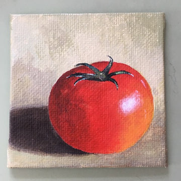
For the cast shadow, play around with your original green mixture for the background and some raw umber.
You will likely end up painting some background colour back over the shadow and blending it to create realistic softness.
I also darkened the foreground on the light side of the tomato here to add a sense of distance from the background.
[Insert Image 10]

This is really an optional step but if you want to add a special touch to any of your acrylic paintings, a fun thing to do is to paint over the top of it with a gloss varnish.
The consistency is different than that of the paint itself, but it’s not too difficult to use. It dries quickly.

And that is the finished tomato! I chose this subject so that you could practice a variety of acrylic painting techniques on an object that’s pretty close to spherical and therefore easy to shade.
You can use these techniques on anything you paint, whether you use a canvas or a sketchbook!