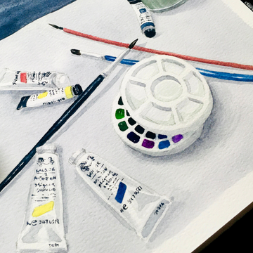
Ah, composition. Quite often an overlooked part of the creative process, the composition is the vital starting point of any artwork and art piece.
It’s the first sign of an artist’s intention, so while it is possible to make artwork without starting at composition, it’s difficult to derive meaning from something that was created without a purpose.
So this is a rundown of a starting point: still-life composition, and how to “make it look good."
Objects

It may be obvious, but with any still-life composition, you should start with still-life, a.k.a. objects.
Most artists start here, as there’s no worry about moving subjects (like humans), or changing ones (like a landscape changing colours depending on weather and time of day).
So grab a few objects you’re interested in drawing and/or painting! It can be anything from stationery to fruits to cups or jars – anything that will fit on top of a sheet of A4 paper.
During the choosing process, it’s also a good idea to get a variety of different shapes, colours, and sizes! For example, if you grab an orange, don’t grab the grapefruit or apple or something similar.
Unless it’s a very intentional choice (e.g. picking only orange-coloured objects to compare them or to practice painting in monochrome), having a good variety will make your overall composition much more interesting.
Tip: An odd number of objects will generally look better than an even number, as it gives something to focus on (because of the “odd one out”). Try not to have too many objects though, unless you’re feeling ambitious!
If this is your first time, I would also recommend putting all your objects on your sheet of A4 paper or white cloth, and if possible, with a plain background as well.
This will give you a much clearer view of the cast shadows, while the plain background will help you focus on the foreground.
Bonus tip: If you can, you should have a fixed light source shining on your objects! It can be a lamp, a spotlight, a flashlight – anything that will provide a constant source of light coming from the same direction. Unless you’re very confident in getting your shadows in the right places or are planning to take a picture and draw from that instead.
Move Them to the Left (or Right)

Once you’ve picked your objects, it’s time to experiment with them! Move them around on your sheet of paper, with your main object in the foreground, and staggering the rest to get the best-looking composition.
Certain objects can be touching each other, while others can be moved forwards or backwards. Stacking them or leaning them on one another can work too!
From here on, it becomes more of an instinct than any hard rules (apart from maybe the “Golden Ratio”, or the “Rule of Thirds”, which has been mentioned in this post on landscape composition).
You can look at famous still-life paintings or photographs for help on this, as this is something that is grasped with practice, and a bit of personal preference.
For example, I prefer compositions where the focus isn’t smack-bang in the middle of the page or canvas. It’s also more interesting when the objects look like they’ve been placed naturally, with a little “ordered randomness” that’s also found in nature.
If you’re still not sure, you can also try whipping out a viewfinder – whether it’s from a camera, or one you’ve made.
If you’re still not sure, try doing some quick thumbnail sketches of the ones you think look good.
You can add some quick shading too, to see how the tones and shadows affect the overall composition. Each sketch shouldn’t take more than 5-10 minutes, though.
Tip: If you find it hard to see the different values (i.e. highlights vs shadows) of your composition, squint your eyes. This will up the contrast you see and help filter out the extra information your brain is getting, such as colours and details.
Experimentation and Thumbnails

The last step is to play around! While there’s technically no “right” or “wrong” composition, it’s always a good idea to sit down and have a good think of where you’d like to place each object, or even associate one object with another, either through proximity or through shape or colour (if the colour will be a factor).
Artists in the past have played heavily on widely-known symbolism, such as a cornucopia to show abundance/fertility, a skull for mortality/fragility of life, or a clock for the passage of time.
While some of the objects we have today may be very different, each one still carries its associations for most people in the world, such as a phone could mean communication/technology, while a handheld electric fan could mean summertime and cool down.
Once you’ve settled on good composition, take note of it – either by taking a picture, or getting a quick thumbnail sketch!
And with this step complete, you can take it to however far you’d like it to go, whether it’s a watercolour painting, a drawing, or maybe it will remain as a composition you’d like to revisit in the future.
Compose Away

As with most things, planning will save you a lot of time in the long run, which is a big part of what makes composition so useful.
And the more you do it, the faster and better you’ll get, which in turn leads to a much more satisfying result!
Eventually, it will get to the point where it comes more naturally, in which case you can try more advanced compositions that involve more complex objects, or a more detailed background scene.
Hope you’ve enjoyed this “back-to-basics” blog post, whether you’ve just started your art journey, or have made your first step a long time ago!
Are you familiar with the composition process? What are your favourite still-life objects to draw/paint? Let us know in the comments below!


