It can look far more saturated than it really is, just because the colours next to it are often greyish browns in a forest.
The greens that come in paint tubes aren’t usually accurate to life, because they are a concentrated pigment, and in real life, there are no concentrated pigments.
To begin mastering green paint, open your paintbox and look at your options for green.
You likely have a warm and a cool tint of each primary colour, and a few secondary colours as well.
Make swatches of any green paint that came prepared in the tubes, so that you can compare them to real-life greens.
Then, mix your warm and cool yellows and blues to see the range of greens you can achieve that way.
Chances are, they will be more naturalistic than the tube green. Another thing to try is mixing different reds and browns with your tube green!
Adding a complementary colour will tame the green down a little and make it more suitable for a realism painting.

The shades of green using lemon yellow, or which predominantly use the tube green, are usually not realistic and should be used only for spring and early summer scenes.
Spring leaves often have a heavy yellow tint, but not in the same way as fall leaves do.

For this little sketch of a spring tree, I used mostly lemon yellow with a bit of Prussian blue and green straight from the tube.
The cool tint in the yellow stops the picture from looking like a fall scene even though the leaves are painted predominantly with yellow.
For the bulk of summer and then during fall, the most realistic green will have a strong gold or red undertone. Use the more muted colours to mix these greens.

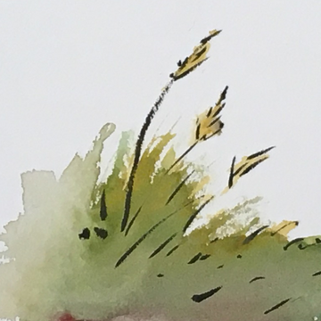
For this little fall grass scene, I put down a layer of yellow ochre before anything else.
Then I added some green from the tube, and finally some red to darken the colour. A complementary colour will often darken your initial colour in addition to muting it.
By mixing a cool red with your green, you will get a deep dark green with not much saturation. This is perfect for evergreens.

For this quick little pine tree, all I used were green and a cool red. You can let some of the red show through unmixed for some interesting variation.
A real tree is never the exact same shade of green throughout.
This is only the beginning of mixing greens for your pictures, but by following these simple instructions, and making swatches of your own to really understand the paints in your paintbox, you can make more accurate landscape pictures starting right now.
Take a look at these photos and try to match the greens! Let us know what you think in the comments!


[Photos by Elsa Wahlstrom]