Did you know that you can experiment with gouache without committing to the purchase of an entire set? All you need to start is White gouache! It can be mixed with watercolour to either touch up a painting or make the entire thing.
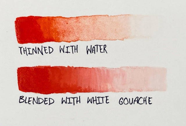
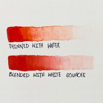
Watercolour and gouache blend quite easily, as they are made out of similar ingredients. As you can see from the diagram above, lightening watercolour with white gouache produces a different texture on the page than thinning it with water does.
Check out this article to learn the difference between Watercolour and Gouache.
As long as you don’t use too much water, you will achieve an opaque paint layer, much like what you would get if you were using gouache entirely. The pigment in the watercolour tints the gouache without changing its texture or opacity.
Now, we are going to make a painting of a flowering hedge, using just white gouache mixed with watercolour! For this demonstration, I am using the Etchr hot press sketchbook, Etchr gouache brush, and Etchr mini palette.

Start by mixing your colours. Mix them as you normally would, just keep in mind that the layers of this piece will be opaque.
Instead of using water to thin the paint, you will want to mix both the light and dark values of the colours. Keep your brush damp and the paint moistened so that it glides onto the paper smoothly.

I’m starting with Prussian blue mixed with the white gouache to create the sky. The mix might look a little marbly at first because of the consistency difference between watercolour and gouache. Keep mixing and blending until you’re happy; maybe the marbled look suits your style!

Make sure this layer is opaque but not too thick. If the paint is too thick, it will be difficult to add more layers without reactivating the paint below. Gouache doesn’t reactivate as easily as watercolour, but it does reactivate enough that you need to be careful layering it.

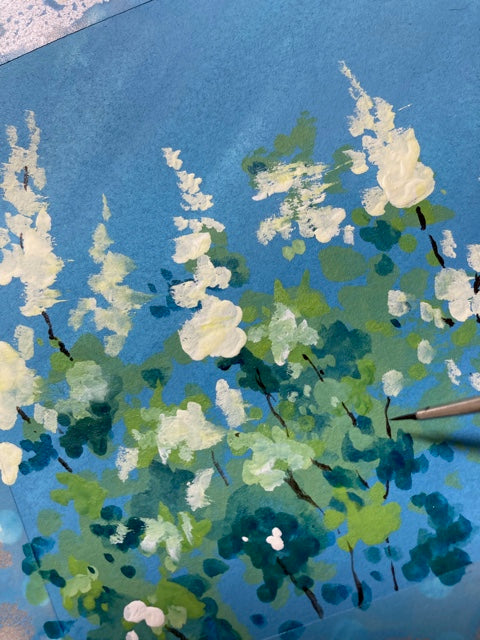
Use your usual foliage green mixture and add white gouache until you’re happy with the value and saturation. Splotch it onto the page, leaving room for the sky to peek through. Don’t worry if this layer blends into the sky too much, because it’s just the start.

You can add some plain Prussian Blue, and it will reactivate the layer below and blend somewhat. Be careful not to overwork the area. This is a nice way to add shadows since the blue is the same pigment as the sky, the atmosphere is consistent.

To add highlights, you can take the green mixture from earlier and add varying amounts of white gouache and yellow watercolour (I used Lemon Yellow) to create the highlights.
Remember, when you plan your lights and shadows, the tree is less about the individual leaves and more about the loose shapes that make up each clump of leaves. Shade them like you would shade a geometric form because that’s what they are when you reduce them to their simplest essence.

For the flowers, take the same yellow you used for the green mix and mix it with the white gouache to make it look creamy.
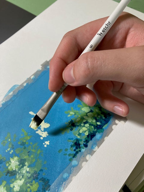
Use the corners and edges of your flat brush to make different marks! You’d be surprised at how much you can get away with using the same brush.
When you are all done with the leaves, you may add the branches. Be careful with this bit, because if you overload the brush, use uneven pressure, or are otherwise imprecise, the branch will not be convincing.
I used plain Burnt Umber watercolour for this. Since I didn't add much water, it was opaque like the gouache. It’s good to have that option when you have to use details because watercolour isn’t as thick as gouache.

Make the branches weave their way in and out of the foliage, ensuring that they’re not overly tidy because that wouldn’t look like nature. Also, make sure that the growth directions are fairly consistent so that it looks like the same plant.
Different species of trees and shrubs usually have different directions for their branches to grow. Study photographs of trees to get this right. Sooner or later you will build up a mental library of branch growth patterns.

You have now painted a flowering hedge in watercolour mixed with white gouache! This process feels similar enough to using gouache only, that by the end of it you will know whether or not you’d enjoy investing in a full set of gouache.
If you're ready to start with Gouache, check out our Introduction to Gouache course!
3 comments
This is very interesting and I will certainly have a go. As there are many whites in Gouache, which one should you buy. Opaque White, Zinc White, or Some have Whites that are just called ‘mixing white’. Can you advise ?
———
Etchr Lab replied:
> > Hi Ruth! Zinc white is warmer and more translucent, making it ideal for > colour mixing since it produces a clear colour tint. Titanium white is more > opaque and cooler. However, it is not recommended for colour mixing. It is > best used alone or to create muted opaque tints of your gouache colours. So > choosing what kind of white gouache to buy really depends on your specific > painting needs. I hope this helps! :) >
I was wondering if you could combine wc and gouache as had some left over watercolor on my palette and added white gouache and found it worked well, but thought perhaps the binders or something would not work so did invest in a starter set of Turner gouache. I didn’t like the Turner paints. Reminded me of a plastic quality of acrylic, at times, compared to oil, but slowly I’m buying better quality gouache paints. Thanks for your time in providing your informative piece. My question was.. have you found a white that you prefer.. not sure which to use.
Yikes. Thank you! I have been disabled by post COVID symptoms for two years. Now that I can haul out of bed and walker myself to garage, I have been longing to resume watercolors. I had taken several rounds of water color classes…most recently in Lagunitas, CA…with a great local teacher working through Marin County College. I have LOTS of supplies…wc tubes, brushes papers. Even fish glitz. My teacher liked fresh trout!!! Which she ate!! So, there was a rule about No White Paint. I like painting birds..so I broke the rule to paint the sparkling eye of a big American Eagle. Everyone in class loved the eye, but not so much the background…which was way too dark. I would love to learn more about using white gouache. As I said, I am now so disabled that I had to ditch my car. My last car. My brain works, but I get joy from color…not crosswords. So, hoping we can connect here.
———
Etchr Lab replied:
We’re sorry to hear about your post-covid situation, Karen. But we’re glad that you’re making art despite the circumstances 🧡 Follow us on Instagram at @etchr_lab and @etchr_studio for more art tips and tricks!