If you’ve ever gone shopping for a sketchbook or pack of paper, then I’m sure you’ve already seen the kind of labelling used for paper.
Apart from its texture, material makeup, and size, you might have noticed a little number as well, that’s usually in the form of “__lb” or “__gsm”, or even “__g/m2”.
In this article, we’ll take a closer look at what these labels mean, and why they matter in terms of watercolour painting.
The Physics of Paper
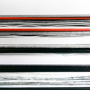
Probably the easiest label to understand is the paper’s size, so no need to explain there! In terms of texture, there are 3 in watercolour – hot press, cold press, and rough.
This indicates how smooth or rough the paper’s surface is, ranging from the smooth hot press to the rough…rough paper.
I won’t get into the differences here, since we already have another article that goes more in-depth about paper texture.
For material makeup, some watercolour papers don’t even mention it. If so, you’re most likely looking at cellulose paper, which is the cheapest form of watercolour paper.
It’s not very absorbent no matter its thickness, and the paint tends to just sit on the surface. This makes it difficult to layer paints on top without accidentally smudging or lifting paint off the previous layer!
This is why many watercolourists recommend cotton-based paper, as it's better for creating depth in your painting (you need those layers since watercolour is such a transparent medium!).
Colours blend better as well, so it’s worth the extra cost!
Bonus tip: You might have seen the label “acid-free” on papers as well. I won’t get into the chemistry of making paper, but long story short, it basically means your paper won’t yellow and get brittle as it ages.
Last but not least is paper weight. Not to be confused with a paperweight (heh), “paper weight” is a term that refers to what is technically the area density of paper.
In layman’s terms, it means how heavy the paper is relative to its size, often boiled down to the descriptors of “thick” or “thin”.
The “lb” label indicates how heavy that paper is (in pounds) when there are 500 uncut sheets of it. How big is the uncut sheet? Well, that depends on the manufacturer.
This means it can get quite confusing if you see 2 sheets of paper that are both labelled “80lb”, but one feels thicker than the other!
This is why you should look for the “gsm” or “g/m2” label instead.
They both stand for “grams per square metre”, which makes for a much clearer and standardised way of indicating paper weight, since it clearly states how heavy the paper is (in grams) when it’s cut into one square metre.
In any case, the general rule of thumb is heavier paper = thicker paper.
Following that is thicker and better quality paper = more expensive paper, which is often the reason why many are reluctant to shell out more money for what looks like nothing but a fancier label.
That being said, I want to show you why paper weight and type is so important. Allow me to experiment a bit with hitting the right balance between price and paper weight.
Budget-friendly “Watercolour Paper”

For watercolour paper, “thin” would be anything below 150gsm. In fact, in the above image, I used 127gsm “watercolour paper”.
Hence the added quotation marks – I find it hard to consider such thin paper “watercolour paper”, as even just 1-2 layers of watercolour paint causes the paper to buckle.
"Buckling" is the term used for when the paper starts to warp from absorbing too much water, which sometimes leads to paint pooling in the wrinkled areas.
It’s a little better if you hold back on the water, but this also means the paper will dry really fast, which means any wet-in-wet techniques will be difficult to do. The paper doesn’t dry flat either! This makes for a pretty frustrating painting experience, which won’t help you in your art journey.
Cotton-based papers may fare a little better, but at this thickness, you might as well use the cheaper cellulose-based paper. Granted, it’s also not worth it for paper manufacturers to make cotton-based watercolour paper at this thickness either!
The bottom line: avoid this lightweight paper, unless it’s to sketch out quick ideas.
Mid-range Watercolour Paper

This would be anything between 150-300gsm. At the low end of 150gsm, you’ll still get some buckling, but at least you can do 3-4 layers of paint before the paper can’t take any more.
This makes it great for an inexpensive watercolour sketchbook where you just want to do work on simple ideas and sketches.

On the higher end of 250-300gsm, you may still get a tiny bit of buckling, but the number of layers you can add increases by quite a lot – around 7-8.
This makes it a great paper weight for more fleshed-out watercolour paintings, and paintings that require heavier washes of paint. It may be a little pricier, but it’s worth it for the extra paper thickness!
Using the wet-in-wet technique (i.e. putting wet paint on a wet surface) also works well here, as the paper takes longer to dry.
Because you’re no longer fighting against time, it becomes a pleasure to be painting on this paper.
Lastly, this paper weight is still thin enough to make into watercolour sketchbooks, such as the Etchr Sketchbooks. And it’s still thick enough to be able to paint on both sides!
If you make it 100% cotton-based as well, then you’re in for a real treat.
Over-the-top Watercolour Paper

These are watercolour papers with a weight over 300gsm, where you’ll have to buy them in sheets because the paper is so thick that it’s difficult to fold into sketchbooks.
It’s so thick that it won’t buckle at all, even under 15+ layers of paint, as seen in the painting above (made on 400gsm paper). It’s also cumbersome and a bit intimidating to buy due to its price, let alone use!
In fact, this could end up hindering your art practice rather than help it, so don’t ever feel like you need this thick of a paper, unless you are consistently creating paintings that use a ton of water and have over 10 layers of paint.
A Weighty Decision

In practice, the type and weight of paper that suits you best boils down to the purpose behind your painting.
Is it to do a simple sketch in 1 layer of paint? Go for the thin cellulose-based “watercolour paper”. But for any painting that needs more depth, and for you to actually enjoy the process, go for good quality, cotton-based 150-300gsm paper.
Whatever the case, the form should match the function. And with all that’s been said, I hope this article has demystified the labelling behind paper, and will help in your future purchases!
What is your favourite paper weight to use? Have you tried watercolour paper that was too thin/thick? Let us know in the comments below!
Nicola Tsoi is a practicing graphic designer and illustrator based in Hong Kong. During her downtime, she likes to watch birds do funny things, search for stories, and bake up a storm. She keeps a pet sourdough starter named Doughy.