The purpose of a colour study is to decide what colours you will use in your illustration before you begin. Artists do this so as to not waste the best supplies on trial and error.
The best thing to do is make multiple colour studies, even if you liked the first one. This way, you're sure to try many different options. You could find colors you like better or you may find a color palette to use for a different illustration.
If you have the time for cleanup, it’s worth doing colour studies in watercolour for the most accurate possible test of your chosen colours. However, watercolours and watercolour paper can be costly. Maybe you only have about half an hour to do art, in which case colour studies with coloured pencils is a great idea.
It’s in those cases that doing colour studies in coloured pencils can be a great idea. In this blog post, I will show you how by drawing some cloud colour palette options.

When drawing with coloured pencils, make sure to do the linework with a light touch. Coloured pencil wears down more quickly than most graphite and is more breakable in the sharpener so handle it with care.

When colouring with coloured pencil, it is best to colour rather lightly at first. Doing so will fill the paper's texture gradually and is a more frugal way to use your pencils.
As you can see here, we are using a negative drawing technique: drawing an object by drawing the space around it instead of outlining the object itself.

Add shadows and colour to your main cloud, keeping in mind the sort of colour harmonies you want. I wanted a cool colour scheme with one contrasting pink that was still pretty mellow to suggest a later part of the sunset.
I chose a cool deep blue for the sky, a periwinkle shade for the shadows, and a peachy pink for the rest of the cloud. I was careful to avoid overdoing the pink, which would ruin the light values.

When your colours are in place as they should be, you can begin to press a little harder with the pencils to give the image more depth and realism by knocking out the paper texture.
Gradually progress from pressing softly to pressing hard because you want to use the minimum amount of pressure to smooth the texture and fill in the area with rich colour.

Here is the first colour study, all completed. I had trouble finding a peachy pink that didn’t grey out the blues because peach is close to orange and orange is the opposite of blue.
If I chose this colour scheme, I would have to mix a cooler pink in watercolour, or else not layer the pink and the blue. The point of doing colour studies is figuring out this kind of information before you realize you have a problem on your final illustration.
Now that you know how coloured pencil sketching works, let us explore some different colour options.

While my first study was meant to resemble the later end of a sunset, the almost-twilight part of the night, this study is about the golden hour in the summer.
I used the warmest blues I had and used a yellow for the body of the clouds to reflect the sun. The temperature in this image is warmer than that of the first and the mood is a bit less surreal.

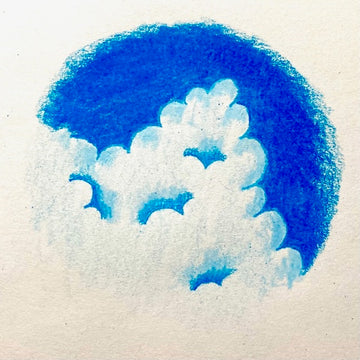
This colour study was about daytime rather than sunset. I only used blue so the sky and the deeper shadows in the clouds were the same shade of bright blue and the lighter shadows at the edges are just a lighter blue. I didn’t add a highlight colour because the clouds at midday appear to be plain snowy white.
Now that we’ve made our colour studies, it’s time to consider each one in light of an illustration. The first example would need some fine-tuning because the peach and the blue mixing become grey. Other than that, the colour combination is ethereally lovely for twilight.
The second colour study has that golden hour feeling; that warmth that encapsulates a summer night where the sun remains in the sky until late.
The third example is midday and this is ideal for a bright picnic illustration or something of that nature.
For my purposes and current projects, the first example is my favourite and I knew it would be from the beginning. However, it’s worth playing with colour and learning what goes together for future projects.
When you use an easy-cleanup medium like coloured pencils, you’ll have time to do more studies without compromising your schedule for the final work!