
It’s a good idea to give some thought prior to executing the colour in your finished drawing. Without a little planning ahead we could end up with a finished piece that looks flat with colours that don’t work well together.
You can keep your colours alive and finish with a very cohesive looking drawing if you plan ahead.
Here’s how I plan ahead with colour to give my ink drawings the best chance to look as good as possible.
Selecting Your Colours
Look at the subject you’ve drawn and think of all the colours that are associated with that image. We’ll use this owl I have drawn as an example:

I can see the owl’s feathers being a mix of brown with a little red in them. Definitely yellow for the eyes. The talons and beak might be grey or black. The tree branch he’s perched on could be brown with a little grey.
Though I haven’t indicated any leaves in ink, I know there will be green leaves and maybe a hint of blue in the background.
After you’ve done this with your own drawing take a look at all the colours you have selected. In this case, I’ve selected:
- brown
- red
- yellow
- grey
- black
- green
- blue
Minimise Your Colours
Take the colours you’ve chosen for your own drawing and now minimise your selections. Keeping your palette simple can be key to a beautiful and well-balanced drawing.
I always try to whittle down the colours I’ve selected to three or four that I’ll use to paint. Check out our Half-Pan Watercolour set to get started!
To do this, take a look at the initial colours you’ve selected for your image and then decide which colours you don’t really need by process of elimination. When possible, start by choosing any primary colours first.
With the colours I have selected for the owl as an example, I know the owl’s eyes are bright yellow so I chose lemon yellow for its brightness and intensity.
Cadmium yellow is bright too, but not as glowing as lemon yellow (while also being a little too orange for this owl's eyes if you ask me.) So that’s one colour!
The great thing about choosing colours is there’s no right or wrong. In fact, choosing your palette can reflect your mood and/or how you see something compared to the next artist.
This is at the core of why we visit art galleries right? To look at how various artists interpret with their choice of colour, line, subject, and more.
We’re all unique in the way we interpret lines and colours on paper or canvas. The second colour I’ll choose will be blue.
I’ll use a cobalt blue because it, too, is bright like Lemon Yellow. When we mix lemon and cobalt they make a brighter green than if we used ultramarine blue.
I probably don’t need red and brown because I can use burnt sienna. Burnt Sienna isn’t a primary colour but has both red and brown in it so that one colour takes the place of two.
Mixing burnt sienna with cobalt blue also makes a fantastic grey so we can confidently add grey to this image as well.
As far as black goes, I don’t personally use black other than the waterproof ink that comes out of my pen.
Prior to colouring any image, I always try to make the drawing as effective in black first so it can stand as a nice black and white drawing all on its own.
Our final colours for this owl are lemon yellow, cobalt blue, and burnt sienna.
Laying In Light Colour
When you begin colouring start with the lightest colour first before adding new lighter layers of different colours.

Don’t be so particular about where you put the colour either. Painting quickly in the general area of where you want the colour will leave empty white spaces that almost always seem to help keep the drawing alive.
I used Lemon Yellow for those eyes and toned it down just a bit with Burnt Sienna.
Getting a Little Bolder
One small trick I learned years ago was to lay in background colour but not on all sides of the character. You’ll notice the ear on the right side of the owl is not covered in the background colour.
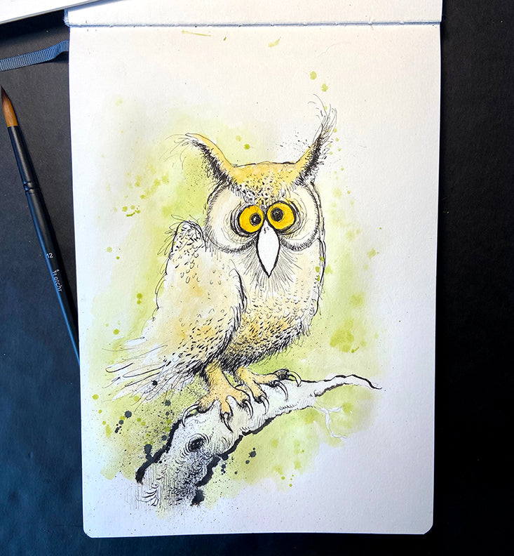
This is just for design purposes as it helps the owl stand out a little more and adds interest to the overall look. Try it out the next time you are painting a character.
Drawings with an irregular shape like this owl are called a vignette. Most commissions from magazines ask me for an illustration in a vignette style so that text can be wrapped around it.
Again, this is for design purposes–it just looks better. Sometimes illustrations done in a square or rectangle shape are called for but they look pretty sterile on the page. I like irregular!
Keep moving the paint around until you cover as much of the background as you would like. Again, don’t be too concerned about those white areas that are not painted in.

I kept the green background light. You can always go darker later. Don’t be afraid of those accidental drips of paint either and when they do happen.
Celebrate it by splashing a little more intentionally around the area. It looks alive!
Additional Layers
By keeping the background light I was able to paint in some leaf shapes with darker green colours and adding cobalt to make even darker greens. In a few places, I used watered down blue, just to add interest.

I added darker colour value underneath the owl’s beak and towards the bottom of the body.
Try using a white gel pen for additional layers and for adding highlights as I did here on the bird’s feathers. I like the added layer of colour pencil lines in the background too, but that’s just me.

Finally, we have an image that is well balanced with the colours all working together and it’s all because we only used three!
Kind of hard to get in trouble when you keep your palette simple don’t you think?
2 comments
Thank you for shearing your thoughts on choosing these three colours. I’ve also followed your course «Introduction to ink» and learnd a lot 😊
Thank you for this well written, step by step guide to adding and choosing colors!