If you’ve just started your journey as an artist, it might be a bit daunting when it comes to colours. How do you choose the right ones? Which mixes work, and which produce “mud”?
In times like these, it’s always best to start small, so here’s a little challenge for you to try and practice: the Two-Colour Challenge.
A Leg Up from Monochrome

Before studying colour mixes, it’s always a good idea to study tones and values first. This is because value gives a subject its shape, plus it’s a simplified way of studying a subject.
If you haven’t done this yet, then I highly recommend doing some monochromatic (i.e. one paint colour) studies first!
Once you’ve mastered the monochrome, you can add a second colour to your palette. Even if you’ve mastered mixing all colours in general, you can always try this two-colour challenge. Having self-imposed limits is a great way to study the basics again or a fun thing to do if you’re going through a bit of a creative block.
Choose Wisely

So what is the two-colour challenge? It’s exactly that – doing a painting using two colours. Which two colours? That’s completely up to you, although if it’s your first time, I recommend going with tried-and-true colour combinations.
Of course, you can always experiment by choosing two colours and mixing them to see if they work well together. You can also pick by throwing all your paints into a box, then closing your eyes before taking two out at random. Most colours should work together since there are only two of them, but you can always pick again if you mix them and find that you don’t like the resulting colour.
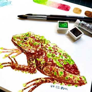
Chances are, you’ll end up with one of two mixes – a subtle mix, or a contrasting mix.
Subtle Mixes

A subtle mix would be having two colours that are next to or near each other on the colour wheel. These will be colours like red and orange, or blue and yellow. They are almost guaranteed to produce good mixes and are relatively harmonious in transition because you’re mixing from one primary colour to another.
The key is to reserve the lighter colour for lighter areas, and the darker one for shadows. I’d say that colours, in general, go yellow -> red -> blue from lightest to darkest, but of course, you can adjust the opacity of your colour by diluting it.
You can also include the white of the paper or canvas for the lightest highlights, or if you’re planning on adding linework, to shade with black or a dark-coloured ink.
Bonus tip: A super-subtle contrast would be if you have two colours from the same colour category, like sap green (lighter) and forest green (darker). It might feel too similar to a monochromatic study, so consider re-picking one of the colours.
Contrast Mixes

In contrast (heh), you can go to the opposite end and pick two complementary colours. These are colours on the opposite ends of the colour wheel, such as yellow and purple, or blue and orange.
Also known as contrasting colours, they will offer a lot more contrast to your painting because they’re so different from each other. Mixing them will produce a more neutral brown or grey colour, so you’ll have to decide whether you like the result!
If you want to do a more in-depth study, you can mix the two colours in varying ratios, and see how they affect the tone of a painting. You can also dilute each mixture to be more or less saturated, and see how the paint pigments interact each other. You may even chance upon a granulating effect!
As with the subtle mixes, reserve the lighter colour for the lighter areas, and the darker colour for shadows. But for the darkest of shadows, you can mix the two colours, since they result in a brown or a grey.
Tip: A lot of the “famous colour combinations” fall under this category, such as burnt sienna and ultramarine blue. They also tend to produce more neutral mixes, which happen when mixing a warm and cool colour.
Wrapping Up

While trying your two-colour challenge, you can also experiment with blending the colours on a wet surface (i.e. the “wet-in-wet” technique) and see how they mingle with one another. Or you could glaze them using the “glazing” technique, where you layer one wet colour on top of the other dried colour and see how they turn out.
But in all cases, don’t forget about your painting’s values and tones! You still want to be able to tell what you’re painting, even if the colours aren’t real to life. If you’re struggling in this aspect, you can always do a quick thumbnail sketch beforehand, and roughly plan out your colours before you paint.
Regardless, have fun with this challenge! There are a ton of different colour combinations you can try, and the more paints you have, the more opportunities you have to experiment. You can discover your favourite colours and combinations, and gain a greater understanding of colour.
That’s it from me! Happy painting, and I hope you have a fruitful art session.
What colour combinations do you like? Are there any you’ve discovered along the way? Let us know in the comments below!
Additionally, if you’d like more tips and tricks on the creative process, feel free to subscribe to our email newsletter. You’ll be kept up to date with our latest workshop schedule and flash sales, too!