It’s generally good advice never to ignore the small print, and that advice also applies here. In this blog, we’ll take a closer look at watercolour paint labels, so break out your magnifying glass and let’s see what the fine print says, shall we?
Not All Paints are Created Equal

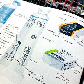
First off, I want to say that not all paints have labels beyond the paint’s colour and name.
This is especially true for paints that aren’t professional- or even student-grade, so if your paints don’t have extra information on them, you can assume that they’re probably not very high quality (though there are exceptions).
Second, even if there are labels with more information, different manufacturers use their own system for labelling their paints. This means that if you’re trying to compare 2 paints from different brands, it might be more difficult if you’re not already familiar with the company’s system.
I’ll point out these differences later, but first, we should take a look at these labels.
What’s in a Name?

One of the first things you’ll probably take note of is the paint’s name. While other words might throw you off, you can get a general idea of what the paint will be from just this.
The most basic names would be standard colour names, like red, yellow, blue, etc. Other paint names might be more specific, like fuchsia, maroon, viridian, etc.
If you’re not sure about the more specific colours, a quick online search should give you the rough hue of what the colour looks like. Mind you, colour names can get really specific!
The third category of paint names are more descriptors that hint at the paint’s formula. This includes words such as cadmium, quinacridone, and dioxazine.
They’re usually only used for certain colours, so for example, cadmium is a heavy metal used to intensify warm reds, oranges, and yellows. Quinacridone is an organic compound that intensifies reds to yellows and browns, and dioxazine is a strong yet transparent violet pigment.
While you could get by not knowing what all these words mean, a paint’s name is such a big part of its label that it would be a shame not to know!
This is especially true when you consider that the colour swatch on a paint label often doesn’t match what the paint actually looks like.
So being able to understand the paint’s name will give you a better hint on what the colour will look like, though I will admit that an actual swatch of the paint is the best thing to have when buying new paints.

Bonus tip: Many art stores will already have a swatch chart hanging next to each different paint rack and brand of paint, or at least be kept somewhere nearby. If you can’t find it, you can ask the staff, as some stores keep their charts behind the counter.
These charts will have each paint’s full information with a key for the symbols as well, so keep an eye out for them the next time you’re in the store.

One other thing that’s usually found near the paint’s name is the paint’s “series”. Depending on the brand, they often range from 1 to 4 or 5, or A to E. This is just a way companies use to divide their paints according to price, with the lowest series being the cheapest.
More expensive paint doesn’t necessarily mean they’re better, but that they’re more expensive to make, as some pigments are rarer than others. I leave this to your own discretion though!
And there’s almost always good substitutes for paints in a higher series, so only buy an expensive paint if you must have that specific colour.
Check out this article on when (and when not) to buy quality art materials to know more.
Specific Pigments

If you’ve already cracked the meaning of a colour’s name and want to go further, a label will often include pigment information.
If only one pigment is listed, it means you have a “single-pigment paint”, which are usually great paints for mixing, as there’s less chance of them being muddied by a different colour. They’re often brighter and clearer, too!
If more than one pigment is listed, you likely have a “convenience colour”, a colour made of 2 or more pigments to create a particular colour that’s convenient to use without mixing it beforehand.
In fact, if you have single-pigment paints of each pigment that makes up the convenience colour, you could mix it yourself!
They’re not necessarily worse than single-pigment colours, as you can save a lot of time by not having to mix the same colour every time, plus you know the colour will always be consistently the same.
Just be careful what pigments have been used, though, as sometimes, they might separate due to having different densities when suspended in water.
In terms of pigment jargon, some artists have gone so far as to memorise what each pigment abbreviation means. For example, PB is “pigment blue”, while PY is “pigment yellow”. And the number next to these initials indicate a specific pigment within that category (e.g. “PB 27” is “Prussian blue”).
I think this extra information is excellent for artists who also like chemistry, or are picky about their pigment colours, or maybe are looking to make their own paints. Still, for the average artist, you’ll be fine just understanding the paint’s name!
Bonus tip: One of the best uses I can think of for memorising pigment names is to spot when a “fugitive pigment” has been used. These are pigments that change colours within a year when being exposed to the elements such as sunlight, which will affect how long a painting will last.
Some artists don’t mind this, but it might be worthwhile to check out a list of fugitive pigments if you do.
Lightfastness

Speaking of fugitive pigments, a paint label will often also indicate a paint’s lightfastness. This means how lightfast, i.e. resistant to fading, a paint is when exposed to light.
Some paint brands indicate this with a star rating (more stars = more lightfast), while others indicate this with a letter and/or number.
In general, better lightfastness is for paintings you’d like to preserve for longer, while practice pieces in a sketchbook won’t matter as much. Though, to be honest, most paintings won’t even begin to fade within 100-150 years if you store them properly!
Here's a more in-depth look at lightfastness and pigment information if you want to learn more!
Opacity, Staining, and Granulating

Last but not least, professional paint labels (and even some student-grade ones) will often indicate a paint’s opacity and staining level.
Opacity (i.e. how transparent paint is) is usually represented by a symbol, which varies depending on the brand.
For example, Winsor & Newton uses a square symbol that’s filled depending on a paint’s transparency. Transparent paints will have a white square, semi-transparent has a diagonal line across the middle, semi-opaque will also have a diagonal line but with half of the square filled in black, and opaque paints will have a black square.
The symbol may vary in terms of number and shape, but generally speaking, a filled-in shape will mean the paint is opaquer, while a blank shape will mean that it’s transparent.
While most watercolour paint you use should be semi- to fully transparent (as watercolour is supposed to be a transparent medium), you can kind of get around opaque pigments by diluting them a little more. Black and white paint will also be naturally opaquer than others.
As for other paint properties, staining is basically how much a paint’s pigments will “stain” the paper. Many dye-based paints will be staining, which means once you’ve put it on paper, it will be impossible to remove it, even if you dab the area with a dry cloth or use other lifting techniques.
It’s a less-commonly seen symbol than the one for opacity, but it often follows a similar aesthetic, where a shape is filled in or not depending on how staining the pigment is.
For Horadam Schmincke paints, they use a triangle symbol, with non-staining pigments being a blank triangle, while staining pigments will have a filled-in triangle.
Only artists who use a lot of lifting techniques will be concerned about staining, which is probably why it’s not usually labelled on paints. But just in case you come across it, you now know what it is!
Bonus tip: Sometimes, the staining symbol shows up as a simple “ST” mark on the paint. Another letter that may be used is “G” for granulating, indicating whether the paint granulates.
Few paint brands will have all this information on their paints, though if you do a quick search for a more detailed watercolour chart, you might be able to find more information.
Final Thoughts

And there you have it! There’s so much packed into those tiny labels on watercolour paints, so hopefully, you’re able to decode them just a little bit better after reading this.
And while you could just get by with a paint colour chart, knowing how the paint will perform and how long it will last will give you a better understanding of your tools and how to best use them (or at least make an informed decision on what to buy!).
Regardless, I hope this blog has helped, and as always, happy painting!
Have you ever looked at paint labels? Do you have any preference in terms of the kind and brand of paint you use? Let us know in the comments below!
Also, if you’d like more tips and tricks about art or want to keep up to date with product releases and sales, feel free to subscribe to our email newsletter.
5 comments
Thank you. This has been the most informative.
Thanks for the information. Very helpful and interesting. It reminds me of information found on a wine label.
———
Etchr Lab replied:
Glad you found this helpful, Julia! 🧡
Thank you for this informative article!
———
Etchr Lab replied:
Thank you so much, Melissa! We truly appreciate it. 🧡
This was so informative! Thank you! I enjoyed the read packed with all its knowledge! 👏🏼👏🏼👏🏼
———
Etchr Lab replied:
Thanks for the love, Ramona! We do our best to share valuable information with all of you! 🧡
So grateful to see this information. It will prove very helpful to me and is quite interesting
———
Etchr Lab replied:
Thanks, Josie! We’re always happy to help! 🧡