Water-soluble coloured inks aren’t talked about online all that much, so many artists either don’t know about them or aren’t sure how to get started.
Paintings done in coloured ink look so similar to watercolour paintings that it can be hard to tell the difference but don’t be fooled by how similar they can look because they’re completely different to actually use.
This post will demystify coloured inks and help you choose between inks and watercolours. I will use an Etchr hot-press sketchbook so that the texture differences between the two media are easy to spot.
(Note: Different brands of coloured inks will be formulated differently, so you may want to try the exercises here for yourself in case your ink is different from the shellac-based ink shown here. I will not be making any comments on lightfastness since that varies from brand to brand with both ink and watercolour.)
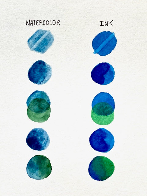
The first pair of swatches test how easily the pigment lifts from the page with a wet brush. The watercolour is far easier to lift, and if I had given it more time the page would have become very close to white.
The ink is less permanent than advertised, but still, it stains the paper more than watercolour does, so be mindful of that.
The second pair of swatches compares how easy it is to darken the colour and blend the shades together after the paint has dried. Watercolour is much easier to blend!
A common issue with ink is that the edges of the puddle will dry quicker and darker than the middle, and any attempt to smooth it out can easily wind up lifting the wetter pigment in the middle.
Be quick and cautious when blending out an edge, so that you don’t end up making the dark streak at the puddle’s edge worse.
The third pair of swatches demonstrates how two colours to layer with each other. In both swatches, I started with blue, then layered green over the top, then added a little more blue to stop the green from overpowering it.
The difference between these two media colour-wise is that watercolour is particles of pigment suspended in water, and ink is more of a liquid stain.
This means that the watercolour hues will mix more, while layered ink will make the new colour more with the light shining through the different layers.
The fourth pair of swatches is a quick demonstration of trying to darken and blend the colours while they’re still wet. The watercolour was once again far easier to blend, due to the nature of the pigment.
The shellac in the ink once again dried quickly at the edges in the drier place of the circle, and if I had gone back in to try and lift the dark edge I would have only lifted the middle and ruined the dark portion of the circle.
Both watercolour and ink have a mind of their own, as is the nature of thin transparent paint. It’s best to let the paints do what they please, and don’t rework anything too much!
The final swatches are another colour mix. However this time, instead of layering green over a fully dry layer of blue, I am blending the colours when they are still wet.
The ink blend turned out softer and more pleasant this time, because this wasn’t layering but rather side-by-side blending. The watercolour, as usual, was easy to blend.
Right away what you’ll gather from these swatches is that inks are far more difficult than watercolours for several reasons. But also, it’s clear to see that the inks have a smooth texture with no granulation, and also the colours are super vibrant.
So it’s true that they’re difficult, but this might be worth it to you depending on your taste in colour and texture.
To get a deeper understanding of the differences between watercolour and ink, it’s helpful to paint a simple geometric form like a sphere with each kind of paint.

The watercolour sphere was made with a lot of wet on wet painting and making sure the paint became more concentrated with each layer.
It was easy to lift pigment with a paper towel to make the highlight brighter. Now, I’ll go into more depth with the process of that ink sphere because it took more finesse.

As with watercolour, you will start with the lightest shades in the painting. Because the ink is pretty much the darkest it can go straight out of the bottle, you’ll want to thin it in the water on your palette to make the lighter shades you’ll need to start with. Use an eyedropper to get the ink and the water into the well.

Use this very thin ink to make an even wash over the circle. Notice how when ink is thinned out, the pigments separate and create some lovely visual nuance.

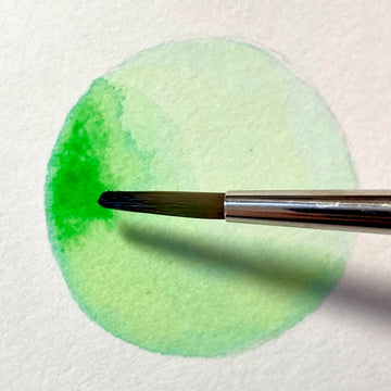
When that layer is still as wet as possible, add another layer with a bit less water. You can see in the picture how the edge of the puddle wants to stay dark! Don’t overwork any areas, and have patience because the picture will eventually look better.
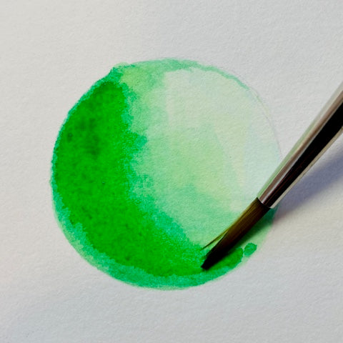
Continue layering with more concentrated ink. A good way to prevent the problem of the jagged edges is to clean the brush, dry it, and drag it sideways on its side across the edge of the wet ink layer. As long as you don’t overwork it, it’s a nice blending trick.

Look at how gorgeous the shellac is! It makes such a pretty shiny surface as it begins to dry, especially as the layers build up.

A problem with doing a monochromatic ink drawing is it takes so many layers to make the colour from the bottle dark enough for a shadow, that eventually you’re layering ink over a sheet of dried ink instead of the paper itself, and that can make the blending more and more difficult.
In the future, I recommend either mixing ink colours to darken them; or starting with such a light tone that the bottle shade will suffice for a shadow.
I left the edges of the super-dark core shadow alone even though they were jagged because I knew that trying to fix it would make it worse; for reasons, I described earlier.
You’ve now seen watercolour and coloured ink compared in a swatch test and a basic first-year-of-art-school type sphere painting exercise. These aren’t exactly “real- world” scenarios, so let’s paint something fun now!
I’ve painted the same cloud scene twice, using the same wet on wet techniques, but with the two different media so that you can see the difference between the results.

The watercolour clouds have a lovely granulation effect with the Prussian Blue in the sky, and the way that the Prussian Blue and the Raw Umber separate slightly in the wet on wet cloud area. These watercolour clouds are soft, gentle, and natural.
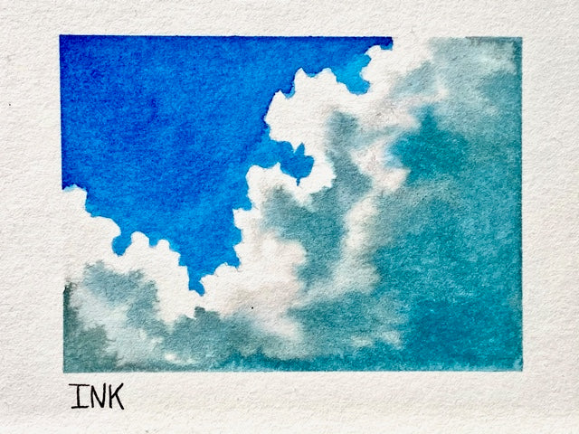
The ink sky is a lot more uniform and smooth than the watercolour sky. The wet on wet technique for the clouds worked just as well here as it did with the watercolour, although I did use a slightly different colour mixture.
To mute the blue enough for the clouds in the watercolour painting, I mixed the blue and the brown. However, the way that my ink set was pigmented made a blue and brown mixture look green! The brown must have had a strong yellow pigment.
Mixing with black paint out of the tube or bottle is usually a huge no-no for realistic art, so this may not work with your ink set, but with my ink set, I am always pleasantly surprised with how the black interacts with the pigments and creates a colour that’s darker and more muted but still lifelike.
If you’re going to mix black into your ink, proceed with caution but also don’t write it off entirely, because ink pigments can do unexpected things, especially when thinned with water.
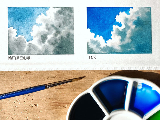
So, which is better, watercolour, or ink? Certainly watercolour is easier and more versatile, and I’d be a fool to not warn you that shellac ink wrecks any brush it dries on (be sure to use synthetic brushes for ink!).
But do easier and more versatile mean watercolour is straight-up better? If you’re looking for a general all-purpose paint, yes it does, but there’s something else to consider.
The colour of the ink is a lot more saturated, and the washes are smoother. If you like that look, then it might be worth it to add ink to your art supply collection. My verdict: Both are wonderful.
If this blog has peaked your interest for coloured inks, check out our article on drawing and painting with coloured inks. Or if you'd like to learn more about watercolour, I highly suggest that you take a look at our Introduction to Watercolour course.


12 comments
Thank you for your article and for taking the time to provide the helpful demonstrations. I’m still learning watercolour and I think it may be a while before I feel ready to try inks. One tiny grammar note: artsy things pique our interest. Mountains have peaks. I will be sure to take a peek at your next blog!
Have you tried this with water based inks like fountain pen ink? Do they pose the same problems as shellac based ones?
Swatches are samples of fabric and the word has no place in art.
When you are testing different colours it’s called a Colour Chart.
Please use the correct terminology 🥰
Brilliant article. Thankyou
Thank you for sharing. I got some inks at Hobby Lobby that were on clearance and love them. However they stopped selling them. Now I’m researching for more colors to add to my collection. Your article has helped show the difference.