


If you’re here, you’ve probably already read Eve’s post on monochrome painting and are interested in learning more.
She covers all the basics of monochrome, so make sure you get a few rounds of practice first! It really does help to paint in shades of grey before tackling the same thing in colour.
A “Value-able” Test

As Eve has mentioned, painting in monochrome is really a test of tones, and concentrating on the subject’s values (i.e. lights vs. shadows) rather than worrying too much about colour.
The best way to do this is to pick one colour to use, then doing a quick swatch of about 10 possible tones you can get out of that single colour by mixing in different amounts of water.
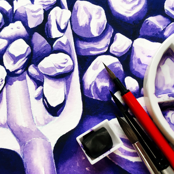
Tip: If this is your first time painting in monochrome (not including black and white studies), I recommend a darker colour such as purple or navy blue, as you get a bigger range of tones compared to a colour like lemon yellow.
Once you’ve made your choice, you can either a) get a palette with at least 10 wells, and mix your 10 different tones, or b) use 1 palette well, and starting with the darkest possible tone, gradually mix in more and more water with your paint, swatching once between each water addition.
If you find it difficult to get 10 different tones, that’s fine – you can start off with 5 instead, and work your way up.
Bonus tip: For a simplified version, you can stick to 5 tones (which includes white and the darkest version of the colour you can get). This would already be enough to get you all the tones you need, as the tones in between will actually be filled in with the eyes as an illusion.
You may also find that watercolours dry lighter than when it’s wet, so the swatch test is also a good exercise to learn how much lighter the colour gets, or if it even changes hue.
Colour Separation

This is more of a side note, but you may notice that some colours go through colour (or pigment) separation.
This occurs with some paints that are made up of more than one pigment. Some artists love the effect while others hate it, so it’s up to your own preferences!
As for me, I tend to roll with it – it can be one of those “happy accidents” that happens with watercolours.
If you’d rather not have to deal with it, then I’d suggest buying mostly single pigment paints, like the Etchr watercolour paints (20 out of 24 colours are single pigment).
Monochrome Mania

After all, that’s been said, the most fun part is the actual painting part! When doing a monochrome painting, I tend to pick a subject matter that matches with the colour’s name.
You can also do a quick thumbnail painting first to figure out where all your lights and darks are. Once you’re satisfied with that, you can get straight to painting!
As usual, paint from light to dark, and work in layers to really build depth and darkness in the areas that need it.
The main objective here is that since you’re only using one colour, you’ll have to make sure that the contrast is higher than usual to make certain details stand out!
Pay attention as well to how the colour changes depending on how diluted it is, as this will expand your understanding of how that specific colour behaves.
Chromatic Conclusion

The great thing about painting in one colour is it’s often a quick and useful study in not only colour tones and values, but also the wide range of shades you can get with a single paint.
It’s easy to underestimate how far one colour can go! And once you get the hang of mixing the right amount of water and paint to get the tone you need, it becomes much easier to see when to leave an area light for those highlights, and when to saturate the paper to make it as dark as possible.
At any rate, this exercise is definitely a step up from a simple colour swatch! But it’s certainly a rewarding one, so I hope you get to try it out someday.
Make sure to comment below if you do (and send a picture for all of us to admire)!
What’s your favourite colour to use in watercolour? Have you ever done a monochromatic painting before? Share with us in the comments below!