Establishing a mood in your illustrations is one of those things where if you’ve done it right, your design strategy won’t be immediately obvious. This makes it rather like designing an appealing website layout: You don’t think about it unless it’s done wrong.
I’m going to tell you some things to consider to do it right, and that way you’ll be able to reverse-engineer the work of your favourite illustrators and make your pictures with the moods you want them to have.
Composition
Deciding on a composition is the very first step of making an illustration, and if you don’t do it right, the picture will be hard to redeem no matter how good you are at the other aspects of it. It’s like the foundation of a house.
Consider how close or distant you want the characters to be, and also consider how the environmental elements tell the story.
Do you want the picture to feel like a wide-open space, or is it small to either be cosy or perhaps claustrophobia-inducing?
Remember all the boring things like the rule of thirds too, because if you can get a handle on basic good design, the rest of the work is much easier.
Character Expression
Knowing how to draw different facial expressions and make them communicate what they’re supposed to be essential for putting mood into the illustration.
This isn’t a post about drawing anatomy so I won’t elaborate overly much on this, but make sure you consider it. It’s another basic thing to know like composition.
Light and Shadow
Now, apart from making sure you’ve correctly lit the illustration (which you should do), it’s important to think about how light impacts mood. Different colours of light as well as different angles create different moods.
A golden sort of sunset lighting is going to feel very different from a straight-on midday light. And as far as artificial lights go, don’t fluorescent overhead lights have a far less restful mood than an incandescent lamp?
These are all things to consider and learn to draw properly.
Colour
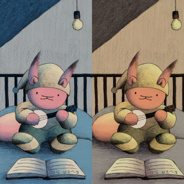
For this, I’m going to show you an example from my process. Before you do a watercolour painting it is useful to do a digital colour study over a graphite value study (and if you do this in a refined manner it can be an illustration in its own right).

The blue tones in this picture enhance the nighttime feeling of the because of the shadows.
That is generally blue or purple. Since cool colours recede visually, the orange of the squirrel contrasts because it is a warm colour (also orange is complementary to blue).

This is the same drawing, that I shaded the same way. The only difference is how I coloured it.
The one place in this whole image where there’s blue is very warm blue.
The yellow tone of this picture makes it feel less dark, so if you were wanting to emphasize the nighttime feeling then the first option would be better for you.
The yellow does feel warmer than the blue, so if you wanted to emphasize how warm and cosy the picture is, this second option would be the better choice.
Putting the mood into your illustrations is largely a subjective thing that only you can decide, but there are objective principles to take into account, so I hope this article helps you be more deliberate with your painting.