Photographs are a funny thing. They are seemingly more accurate than paintings, but unless the photographer is a professional- there will always be something missing.
The lens might distort the size, placement, and colour of objects in a way that goes unnoticed until you go to paint from the photo and realize that what’s missing is what made the picture worth taking.
A camera is a machine, after all, and machines don’t perceive beauty. A professional photographer can bypass this, but for most of us, a photograph is an empty shell of the moment that was.
To paint from a photograph is to paint from a mechanical interpretation of the world, and to try and breathe life back into it. This is why your art teachers tell you to paint Plein air instead of from photographs.
However, it’s not always feasible or practical to paint outside. Here is a quick guide to salvaging the pictures on your phone into good paintings. 
Here is a photo I took from inside a moving car; on an older phone that couldn’t have done a better job even if I’d been outside and standing still. The trees are blurry and there’s a distracting blue glare.
The composition isn’t super, and the colours are a little distorted from what they were. When I took this photo, I was disappointed because I wanted it to be easier to paint from than it is, but now it’s been a few years and I know how to paint better now, so I can dive in.

By cropping the photo, I have improved the composition and gotten rid of some of the signs that this was taken from a moving car. The trees are still blurry, but we can fix that in the painting.

I decided that gouache would suit this painting. This step will take some finessing because you have to choose the colours for the sky while keeping in mind these things:
(a) the photo is not entirely accurate.
(b) nothing you do will look quite right without the trees painted in at the end.
What you need to do is make sure the colours you choose look good with one another. Then it does not matter if they’re not entirely photo-accurate.

Now it’s time to paint the trees, and I’m going to show you a little trick one of my art professors taught me after hours.
It’s common knowledge that black paint from the tube doesn’t look organic enough for 95% of painting subjects, but nobody explains how exactly you’re supposed to mix your black paint.
Well, the answer is to mix red, blue, and green. The more the shades clash, the better. Just add red, blue, and green until they completely neutralize each other so, you’ll have an earthy black.
Black in photos tends to look very mechanical. This shade will likely not match the photo. (I’m using Etchr’s Mini Palette to mix colours on this painting because it is lovely and just the right size for a cluttered desk!)

Be very careful adding the ground layer so that you don’t reactivate the paint underneath. Experiment with your flat brush to see how many organic shapes you can make by holding it in different ways.
Can you make a bush? A tree? I hint of an old branch? Leave some gaps inside the shape of a larger tree to make it look more like a tree since that shows light coming through the leaves a bit.

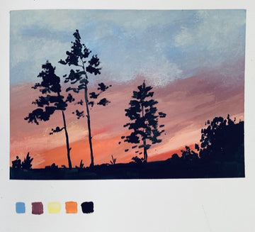
Now for the pine trees. Use a round brush to ensure you get the correct rounded shapes.
Use your knowledge of trees to correct the areas that are blurred in the photo. Perhaps change the shape and amount of trees to make a good painting composition. The photograph is only a starting point!
If you compare the photograph and the painting as a sort of “before and after picture” pair, you will find that they’re dramatically different. This will probably be true anytime you are working from a low-quality photograph.
Trust your judgement and everything will be fine. By learning to adapt low-quality photographs into paintings, you not only have more choices of reference photos to work from but also have the chance to recreate your old photos in a way that’s closer to how you remember the places being in real life.
1 comment
Yes, i will do it.
———
Etchr Lab replied:
Go for it, Husna!! 😁