In my previous blog post, we made a colour wheel from an existing watercolour palette and talked about the importance of knowing colour complements. A colour’s complement is its direct opposite on the colour wheel.
When you’re looking to perfectly neutralize a colour, greying it down to a complementary colour is what you should do. And this very same information is just as useful when you’re trying to keep a hue vibrant because you’ll know which mixes to avoid.

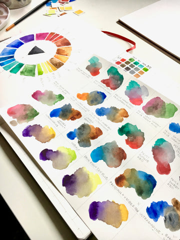
If you don’t know the direct complement of each colour in your palette, I recommend reading the previous post and making a colour wheel using the instructions.
Also, if you need a crash course on colour theory, read this article Crash Course on Color Theory blog post.
But what else can you do with your newfound knowledge of colour complements? Colour wheels are not only handy when it comes to mixing paints. They are also a convenient tool for choosing colour schemes for your paintings!
Colour schemes based on complementary colours can be very visually striking and eye-catching, like this Vincent Van Gogh painting:
 Vincent Van Gogh, Café Terrace on the Place du Forum, Arles, 1888
But, they can also create a lot of visual tension; or even vibration. Vibration is like the visual equivalent of shouting.
 Sometimes vibrating colours are used intentionally to achieve a certain effect, but it’s not the quality we are usually aiming; for.
And although pairings of complementary colours create some of my favourite colours schemes, sometimes the mood of a painting demands a little less intensity.
So what can you do if you love using complementary colours; but want to tone it down? Let me introduce you to the split-complementary colour scheme.
Split-complements can be found by locating the direct complement of colour on the colour wheel and then finding the hues to either side of it.
Here is how it works:

The complement of red (R) is green (G).

So the split-complements of red (R) are blue-green (BG) and yellow-green (YG).
Like complementary colour palettes, split-complementary colour schemes are still visually striking due to the strong contrast in colours but, split complements are slightly closer to the base colour on the wheel. And they have less visual tension and more interest and variety.
When choosing a split complementary colour palette for your art, first decide on a base colour. That will be the primary colour in your painting.
Then find the two split-complements of that colour. Remember that your split-complements will be secondary, which means you will use them more sparingly in your painting.
Once you’ve chosen a set of split-complements you might also want to experiment with shifting the colours slightly to the left or right to see how this change affects the mood of your art.
You might even stumble across a colour combination you wouldn’t normally think of using!
Split complementary palettes are fun and easy to use especially knowing how to find the split complements of colour can really simplify colour choices when painting.

Artist Sybil Cohen used a split complementary colour scheme to inspire this absolutely gorgeous Plein air scene.
Her base colour was yellow-green, where she mixed Linden Green and Ultramarine Gouache.

Depending on the range of your palette, you may need to mix colours to create your split-complementary trio. For example, your split-complementary colour scheme might call for a red-orange, and if you don’t have a red-orange on your palette, you’ll need to mix one from red and orange.
As you can see from Sybil’s painting above, split complementary colour schemes can allow for more creative freedom in colour choice than straight complements and tend to produce paintings that are cheerful and refreshing.
You can find more of Sybil Cohen’s work on Instagram.