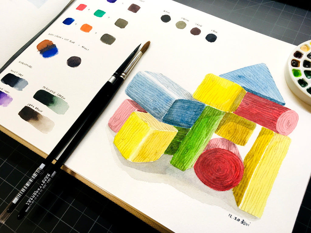
I will admit: it’s very tempting to head straight for black paint when painting dark or shadowed areas in the watercolour.
Even if you’re not using it straight from the pan (or tube), it’s tempting to mix it in with another colour to darken it.
However, with a bit of colour theory knowledge and practice, it’s actually quite easy to get dark colours without having to use black at all! I’ll show you how in today’s blog post.
Opposites Attract

When opposites attract, we often say they are “complementing” one another.
This is true of complementary colours – opposite colours (i.e. colours that are directly opposite one another on the colour wheel) often create the best contrast, such as red and green, yellow and purple, or blue and orange.
They also create the darkest colours when mixed together, which is one great way to get dark greys and browns without actually having any brown, grey, or black paint.
This is why limited palettes work well in watercolour, even if you only have the 3 primary colours of red, yellow, and blue (in this case you can mix all 3 primaries to get a dark colour!).
Depending on which 2 complementary colours you mix and the amount you use of each colour, you’ll get a slightly different resulting dark colour. Feel free to experiment with your own paints!
I recommend starting with the most neutral of colours, before experimenting with warmer and cooler hues of the same colours.
For example, a good neutral red will be primarily red, while its complement will be a mid-green. I like using these two complementary colours for getting a dark, earthy brown.
Alternatively, mixing a cool colour with a warm complementary colour also results in a great neutral dark, such as cadmium red (a warm red) and phthalo green (a cool green).
Mixing warm and warm, or cool and cool colours will result in a warmer or cooler dark colour respectively.
Another match made in heaven would be Burnt Sienna (which is a warm, dark orange) mixed with Ultramarine Blue (a cool blue). This gives a lovely warm blue/grey, depending on the ratio of paints used.
Tip: The Burnt Sienna + Ultramarine Blue combo is frequently used among artists from across different media, including acrylic and oil painters! So don’t be afraid to try this mix outside of watercolour.
Alternative Colours

If you’re a bit more hesitant to mix colours (for instance, if you’re painting outdoors), or prefer to use paints as they are, then a good alternative would be to find a ready-made dark paint colour that isn’t necessarily black.
One of my favourite colours to use here is Payne’s Grey. Indigo is also fine, though I tend to find it a little too blue.
A dark purple, green, or brown also works depending on what you’re painting, though I prefer Payne’s Grey for its warm blue undertones, which makes it work well for shadowed areas.
Because of watercolour’s transparent nature, you can layer this paint on top of other colours, which is part of the “glazing technique” – perfect for adding depth via shadows to your painting!
If You Must

Lastly, if you really want to, you can use black and mix it into the colour you need to get a darker version of it. Some watercolourists don’t prefer this option though, as it’s easy to muddy your colours this way.
Black is also a bit of a deadening colour, as it creates somewhat of a “black hole” – which makes sense, as scientifically, the way we see black is because it absorbs all the colours in the light spectrum.
To maintain that bright luminosity inherent in watercolour paints, it’s best to avoid black – though it’s ok to use in small mixing quantities.
Again, you can experiment with this by mixing different amounts with different colours to see how it affects the resulting colour.
Perhaps the best use for this would be if you’re trying to mix a shadow colour for yellow if you’re worried a dark blue on top of a yellow would end up looking too green for your liking.
Hello Darkness

In any case, there are a variety of options to choose from when trying to get dark colours.
The best thing to do is play around with the saturation and the mixture ratio of your paints!
You’ll start to see what the best colours are for your painting, your subject matter, and your style.
If you have time, you can also create a mixing chart or a glazing chart from your palette. This will give you a clearer picture of what colours you can create out of what you have, or maybe even point out what your palette may need.
That’s it for now! Have fun experimenting with your paints and trying out new (or old) mixes!
What’s your favourite dark colour or mix to use? Do you use the same colours and mixes in other media? Let us know in the comments below!


